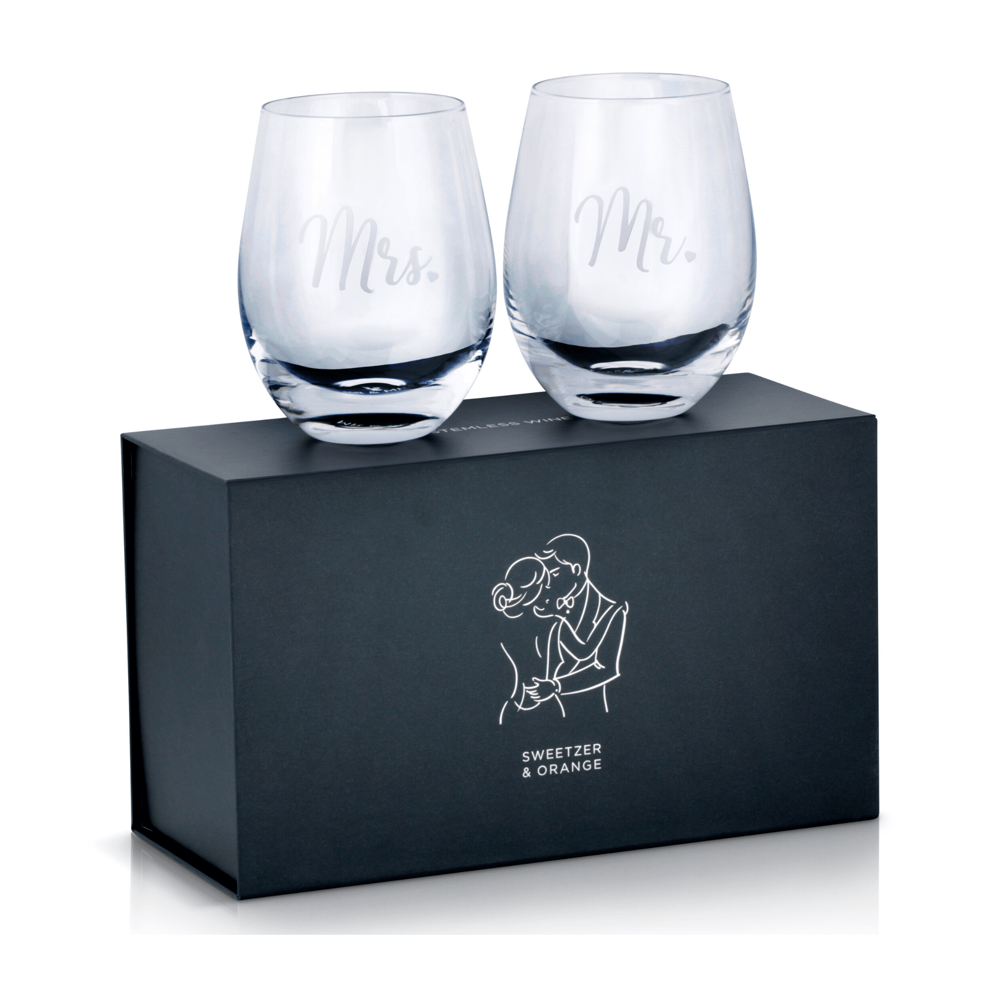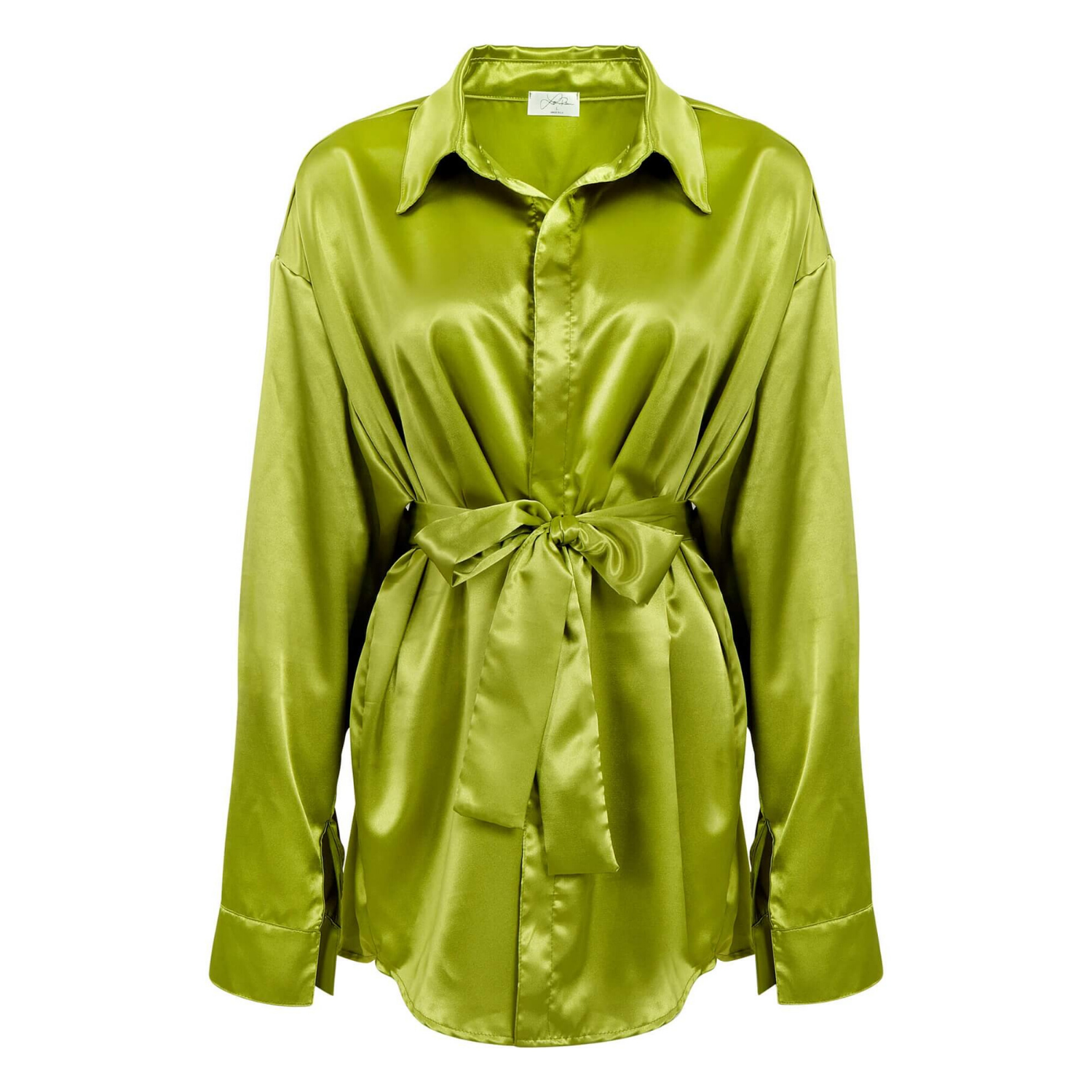
A product image can look polished in a design file and still fail where it matters most: on a marketplace listing, collection page, or mobile screen. The choice between a white background versus transparent background affects compliance, perceived product quality, page speed, design flexibility, and how confidently shoppers can evaluate what they are buying.
For ecommerce brands, this is not simply an editing preference. It is a merchandising decision. The right background helps your product stand out without creating friction. The wrong one can produce rejected listings, inconsistent visuals, or products that seem to float awkwardly on the page.
White Background Versus Transparent Background: The Core Difference
A white-background image has a solid white field behind the product. In commercial product photography, this is typically photographed or retouched to a clean, even white – often RGB 255, 255, 255 – with controlled shadows and accurate edge detail.
A transparent-background image removes the background entirely. The product is delivered in a file format that supports transparency, usually PNG, so your web team or designer can place it over a colored page, lifestyle scene, campaign graphic, or custom layout.
Both options can be professionally photographed, color-corrected, and retouched. The meaningful difference is how and where the image will be used. White is a finished presentation. Transparency is a flexible asset that still needs a final background when it appears online or in print.
When a White Background Is the Better Choice
White backgrounds remain the standard for ecommerce because they make products easy to compare. They reduce visual noise, keep category pages consistent, and help buyers focus on size, shape, color, material, and features.
For many sellers, white is also a platform requirement. Amazon main images, for example, generally require a pure white background. Other marketplaces and major retail channels use similar image standards because uniform product photos create a cleaner shopping experience. If you are preparing a listing for a marketplace, confirm its current image requirements before production begins. A beautiful image is not useful if the platform rejects it.
White is particularly effective for products with complex surfaces. Jewelry, watches, glassware, beauty packaging, electronics, and reflective metal all benefit from controlled studio lighting and a clean white environment. The photographer can retain natural reflections, subtle shadows, and edge definition without introducing a distracting scene behind the item.
A white background is also often the safer option for apparel. Accurate color is a major conversion factor, and a neutral setting prevents a colored background from changing how customers perceive the garment. Whether apparel is photographed flat lay, on mannequin, or as a ghost mannequin image, clean white creates a consistent storefront and supports faster product comparison.
There is a practical production advantage, too. A well-executed white-background photo may require less downstream design work than a transparent cutout. That can help brands move a new collection from studio to storefront faster while controlling image costs.
White does not have to mean flat
A common mistake is asking for a “plain white image” and receiving a product that looks lifeless. Pure white behind a product should not mean harsh lighting on it. The best ecommerce photography uses light direction, controlled highlights, and restrained natural shadows to show depth.
For a skincare bottle, that may mean a soft shadow that grounds the bottle without making the white background appear gray. For a gemstone ring, it means preserving sparkle and metal detail while keeping the frame clean. For a black appliance, it means separating dark edges from the background so the product does not disappear on a white product page.
When Transparent Backgrounds Make More Sense
Transparent-background images are valuable when your brand needs design freedom. A clean cutout can be placed on a colored collection page, a seasonal email, a social graphic, a printed catalog layout, or a paid ad without photographing the product again.
This format works especially well for marketing teams building multiple creative variations from the same product asset. A transparent PNG of a beverage can, beauty product, toy, or accessory can be positioned beside text, layered over an on-brand color, or grouped with related products in a campaign layout.
Transparency is also useful when the website uses a background color other than white. If a product detail page is cream, gray, black, or brand-colored, placing a pre-made white rectangle inside the layout can look dated and inconsistent. A properly extracted product gives the design team more control.
Still, transparent does not automatically mean better. Cutouts can look artificial when edge work is poor, especially around hair-like fibers, sheer fabric, chains, gemstones, clear glass, and glossy packaging. Every edge needs careful retouching. A rushed selection can leave white halos, jagged contours, missing details, or unnatural transparency in reflective areas.
File format matters
Transparency requires the right deliverable. JPEG files do not support transparent backgrounds. PNG files do, although they can be larger and may affect page performance if not optimized for web use. Other production formats may be appropriate for print or design workflows, but they should be discussed before the shoot.
If you only need images for an Amazon main listing, transparent PNGs may add unnecessary cost and file-management complexity. If you need marketplace images plus ads, banners, and email graphics, having both a compliant white-background image and a transparent cutout can be a smart investment.
Choose Based on the Final Placement, Not Personal Preference
The fastest way to make the right decision is to work backward from where the product will appear. A product photo has a job to do, and that job changes by channel.
For marketplace main images, choose white unless the platform explicitly allows another treatment. For ecommerce category grids, white is usually the most consistent and conversion-friendly choice. For product detail pages, the answer depends on your site design: white may be ideal for clarity, while transparency may better support a custom background.
For campaign creative, social media, email, and print layouts, transparent files offer more flexibility. For catalog pages that need uniformity and accurate product representation, white backgrounds are often easier to manage and reproduce.
Do not overlook the buyer’s screen. On a mobile device, a transparent product placed over a busy color or texture can lose clarity. A white image may look simpler, but simple often performs better when a shopper has only a few seconds to scan a listing.
How Background Choice Affects Product Accuracy
Backgrounds change perception. A warm beige background can make white packaging look cream. A cool blue background can make silver jewelry feel colder and alter the appearance of clear glass. Saturated colors can affect how shoppers judge apparel, cosmetics, and gemstones.
This does not mean brands should avoid colored backgrounds in advertising. It means those images should be intentional and supported by accurate product views. A shopper who receives a product that looks different from the listing is less likely to return, more likely to leave a negative review, and less likely to purchase again.
For color-sensitive products, include a clean white hero image among your core assets. Then use transparent cutouts or styled photography for supporting content. This combination gives shoppers an honest product reference while giving your marketing team room to create stronger campaigns.
A Practical Asset Plan for Growing Brands
Brands do not need to choose one format forever. The most efficient approach is often to plan image deliverables around actual sales channels.
Start with high-resolution white-background images for marketplace compliance, product pages, and catalog consistency. Add transparent-background versions for priority products that will appear in paid advertising, email, or branded web layouts. For top-selling items, include detail images and lifestyle photography that explain scale, texture, use, or key features.
This approach avoids paying for every possible version of every SKU before it is needed. It also prevents the opposite problem: launching products with only one basic image and having no usable assets when a campaign needs to move quickly.
At Product Photography Studio, we help clients define the image treatment before photography begins, so lighting, retouching, file formats, and delivery requirements support the final use. That planning is especially valuable for products with reflective, transparent, or intricate surfaces where background removal requires more than an automated cutout.
Give Each Image a Clear Commercial Job
White backgrounds and transparent backgrounds are not competing standards. They solve different business problems. White helps products meet requirements, look consistent, and sell clearly. Transparency gives your team the freedom to build branded creative without starting from scratch.
The best choice is the one that supports the next place your customer will see the product. Plan for that placement before the camera comes out, and your product images will work harder long after the shoot is complete.