A navy dress that arrives looking almost black, a cream sweater that appears bright white, or a red shirt that reads orange on a listing can cost a brand far more than a single sale. Apparel color accuracy shapes shopper confidence before a customer can feel the fabric, check the fit, or see the garment in person. When product images show color honestly and consistently, they help buyers make faster decisions and set more realistic expectations after delivery.
For ecommerce brands, marketplace sellers, catalog teams, and apparel retailers, accurate color is not a cosmetic detail. It is a merchandising requirement. Strong apparel photography protects brand presentation, supports conversion, and can reduce the frustration that leads to avoidable returns.
Why Apparel Color Accuracy Affects Sales
Online shoppers cannot compare a product photo with the actual garment until after they buy. Color becomes one of the most immediate signals they use to decide whether an item matches their wardrobe, an event, a season, or a brand they already know. If the visual is noticeably off, shoppers may hesitate to add the item to their cart. If they buy and the color does not meet expectations, they may return it.
The risk is especially high with colors that are easy to misread under poor lighting. Black can lose detail and look flat. White garments can pick up blue, gray, or yellow casts. Pastels can look washed out. Saturated reds, oranges, purples, and neons can shift dramatically depending on the camera, lighting, monitor, and image compression.
Color also affects perceived quality. A garment photographed with inconsistent white balance can look inexpensive or poorly made even when the actual product is premium. For a brand selling multiple colorways, inconsistent imagery can make a coordinated collection look disorganized. Customers should be able to compare a camel coat, charcoal coat, and black coat with confidence, not wonder whether each image was shot in a different environment.
Accurate Color Starts Before Retouching
Professional post-production is valuable, but it cannot reliably rescue a file that was captured under uncontrolled light or with the wrong exposure. The best results begin with a controlled photography setup designed specifically for the garment, its fabric, and its intended sales channel.
Use Consistent, Calibrated Lighting
Lighting temperature and quality determine how the camera records color. Mixed light sources are a common problem. A garment photographed near window light while also lit by warm studio lamps can show competing color casts across the same item. That makes neutral correction difficult and can leave whites, grays, and skin-adjacent tones looking unnatural.
A controlled studio workflow uses consistent lighting from capture to capture. This matters when photographing a large SKU count over several days, restocking a bestseller months later, or adding new products to an existing collection. The goal is not simply to make every garment look bright. It is to make the color relationship between products dependable.
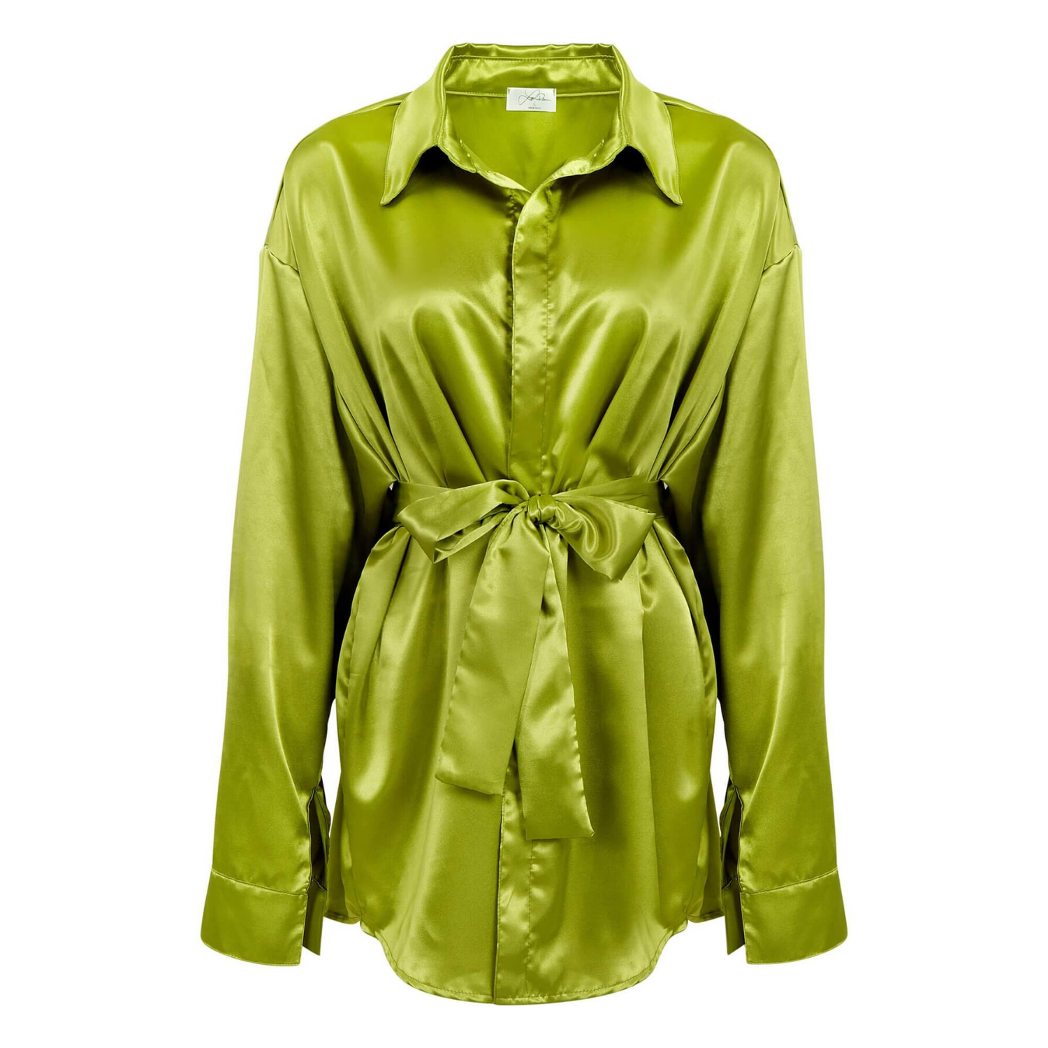
Fabric texture matters, too. Matte cotton, glossy satin, washed denim, ribbed knits, velvet, sequins, and technical performance fabrics all react differently to light. A setup that works for a flat cotton tee may create unwanted glare on a silk blouse or obscure the depth of a dark velvet jacket. Lighting should be adjusted to reveal the garment’s actual tone, weave, finish, and detail without creating artificial highlights.
Set Exposure for the Garment, Not the Background
Clean white-background photography is a standard for ecommerce and many marketplaces, but an overly bright background can damage color information at the edges of the apparel. Light-colored garments are particularly vulnerable. If the background is pushed too far, a pale beige top can lose its separation and appear white.
The right approach preserves a clean background while maintaining edge detail, shadows, and the true tonal range of the product. Dark apparel presents the opposite challenge. A black garment needs enough controlled light to show seams, drape, pockets, and texture, but not so much that it turns charcoal or gray.
This is where commercial experience makes a visible difference. Apparel photography is not a one-setting process. Exposure decisions should account for the garment color, material, styling method, and final use of the image.
Photograph a Reference for Reliable Correction
Professional teams use color references and calibrated monitors to evaluate files accurately. These tools provide a known standard during capture and editing, helping photographers and retouchers identify shifts that might otherwise go unnoticed.
Without a reference workflow, an editor may make subjective adjustments based on a display that is too warm, too cool, overly saturated, or poorly calibrated. The result can look acceptable on one screen and inaccurate everywhere else. A managed color workflow reduces that uncertainty and creates a more consistent handoff from the studio to your website, marketplace listing, catalog, or advertising team.
Retouching Should Correct, Not Reinvent
Retouching is where apparel images become polished, but the objective should remain honest representation. Remove distracting lint, minor dust, hanger marks, temporary wrinkles, and small presentation flaws. Refine the garment shape when needed. Keep the product color grounded in the physical sample.
Over-editing is a real business risk. Increasing saturation to make a garment stand out can make the product more clickable in the short term, but it can also create an expectation the shipped item cannot meet. The same is true of making ivory look pure white, turning faded denim into a more intense blue, or removing the subtle variation that gives a garment its character.
There are exceptions. Campaign imagery may use more stylized color grading to create a mood, especially for editorial lookbooks or social creative. That can be effective when the goal is brand storytelling. However, your main product listing images should prioritize accuracy. If you use both styles, keep the primary ecommerce image color-faithful and reserve heavier grading for supporting creative.
How to Maintain Color Consistency Across a Collection
A single accurate image is valuable. A complete collection that looks consistent across every product page is more valuable because it strengthens the brand experience and makes merchandise easier to shop.
Start by documenting the visual standard for your product imagery. Define the preferred background, crop, shadow treatment, garment positioning, brightness, and level of retouching. Decide whether color swatches, detail shots, front and back views, flat lays, ghost mannequin images, and on-model photos will be included for each category.
Then send reference samples or approved images when you have them. If a particular shade is critical to the product story, flag it before the shoot. This is useful for signature brand colors, seasonal hues, matched sets, bridal garments, uniforms, and products sold in several close shades such as sand, oatmeal, bone, ivory, and cream.
For ongoing photography, use the same studio standards whenever possible. Changing photographers, lighting approaches, or editing styles without clear direction can make a product catalog feel fragmented. A repeatable process helps new launches sit naturally alongside established products.
File Delivery Also Influences What Shoppers See
Even a well-captured, carefully retouched image can shift after export. File format, color profile, compression, and platform processing all influence the final result. Ecommerce platforms and marketplaces may resize or compress uploaded images, and customer screens vary widely in brightness and calibration.
You cannot control every phone or monitor a shopper uses. You can control the quality of the master image and prepare files correctly for their destination. A professional studio should deliver high-resolution assets that preserve useful color information, while also creating web-ready versions that load efficiently and meet platform requirements.
Before a major launch, review a sample of final images on desktop and mobile. Check the listing pages themselves, not just the files in an editing application. This simple quality-control step can reveal whether a platform’s image handling has changed the appearance of pale fabrics, deep blacks, or saturated shades.
When Color Matching Needs Extra Attention
Some products require a higher level of scrutiny because even a small shift changes the buying decision. Bridal apparel and occasionwear are obvious examples, where ivory, champagne, blush, and white must be clearly differentiated. Athleticwear also needs careful handling because vivid colors, reflective trims, and technical fabrics can react unpredictably to lighting.
Color matching is equally important for uniforms, branded merchandise, children’s apparel, fashion basics, and coordinated sets. If a customer expects a sweatshirt and jogger to match, product images should not make one piece appear cooler or darker than the other. For multi-brand retailers, consistent color handling across suppliers helps maintain a professional storefront even when samples arrive from different manufacturers.
Product Photography Studio applies controlled lighting, detail-focused retouching, and commercial apparel photography standards to create images that are clean, consistent, and ready for ecommerce, catalogs, and marketplaces. The right process helps your team move faster without compromising how accurately the product is represented.
Your apparel images do not need to promise a color that fabric cannot deliver. They need to present the garment clearly enough that the right customer feels confident clicking Buy.