A shopper cannot pick up your product, test its weight, inspect its finish, or compare its true color from a screen. Your photos have to do that work in seconds. That is what makes good ecommerce product photos a sales tool rather than a basic listing requirement: they answer buying questions clearly enough to move a customer from interest to checkout.
For Amazon sellers, direct-to-consumer brands, and retail teams, strong product photography is not about making an item look artificially expensive. It is about presenting it accurately, professionally, and consistently so shoppers feel confident buying it. The right image can earn the click. The full image set can earn the sale.
What Makes Good Ecommerce Product Photos Work
Good ecommerce photography balances visual appeal with useful information. A beautiful image that hides the product’s real color, size, texture, or function may create attention, but it can also create returns. On the other hand, technically accurate photos that feel flat or poorly lit can make a well-made product look ordinary.
The goal is a product presentation that is clean, persuasive, and honest. Shoppers should immediately understand what is being sold, why it is worth considering, and what they will receive.
A clear, product-first main image
Your main image has one job: make the product easy to identify at a glance. On many marketplaces, it must also meet strict platform standards, including a white background and a product that fills most of the frame. A clear hero image gives customers a fast visual read without distracting props, cluttered styling, harsh shadows, or confusing angles.
Framing matters. If the product is too small in the image, details disappear on mobile screens. If it is cropped too tightly, shoppers may not understand its shape or proportions. The best crop depends on the item, but the product should feel prominent, complete, and easy to evaluate.
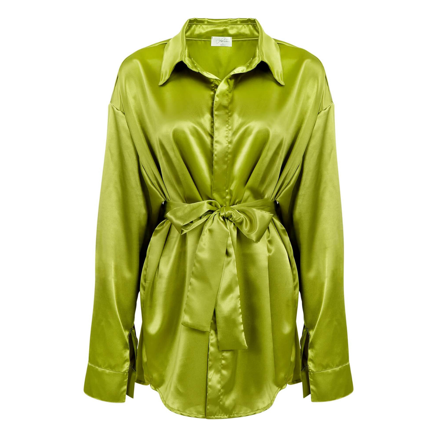
For a watch, that may mean a straight-on image showing the face, band, and finish. For a skincare bottle, it means legible labeling and clean edges. For apparel, it means a fit and color presentation that does not leave customers guessing.
Lighting that shows shape, finish, and quality
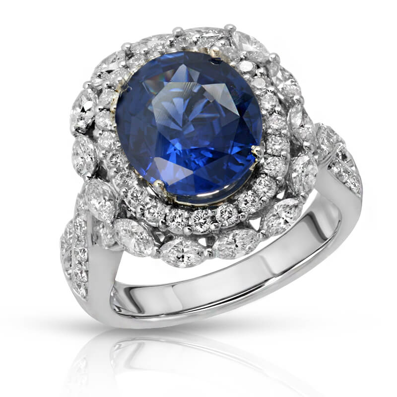
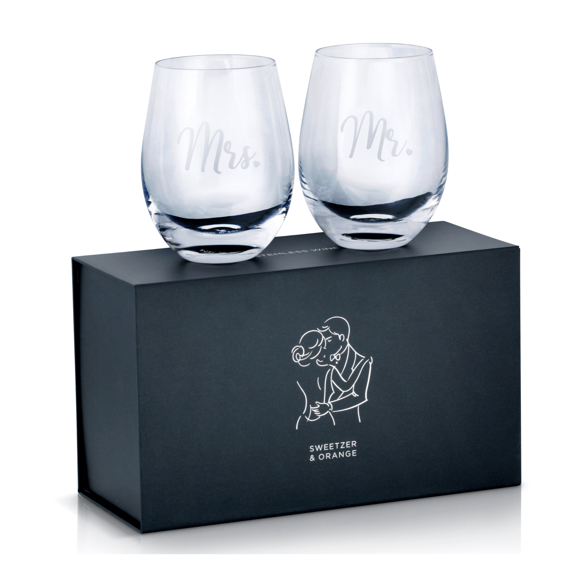
Lighting is often the difference between a product that looks premium and one that looks like a quick phone snapshot. It reveals contours, materials, texture, and craftsmanship. It also controls reflections, which is especially important for jewelry, glassware, watches, cosmetics packaging, electronics, and polished metal.
Soft, controlled lighting usually creates a clean commercial look because it reduces distracting glare while maintaining enough contrast to define the product. But there is no single lighting setup for every category. A gemstone needs lighting that brings out sparkle and cut. A matte black appliance needs careful edge definition so it does not disappear into the background. A beverage bottle may need highlights that emphasize coldness, clarity, and label design.
Good lighting is intentional. It supports the product’s selling features instead of simply making the scene brighter.
Accurate color customers can trust
Color accuracy is a conversion issue. When a customer orders a navy dress that arrives looking much brighter than the listing, or a lipstick that appears noticeably different in person, disappointment follows. Returns, negative reviews, and lost repeat business can follow with it.
This is particularly critical for apparel, cosmetics, paint-related products, home goods, and branded packaging. Accurate color requires more than a well-lit camera shot. It depends on controlled lighting, calibrated equipment, thoughtful post-production, and a review process that compares the final image to the physical item.
There is a trade-off here. Heavy color enhancement can make an image pop on a crowded product page, but it can also misrepresent the item. Commercial retouching should refine an image, not invent a product the customer will not receive.
Detail images that answer objections
A single photo rarely provides enough information for a considered purchase. Shoppers want to inspect the details that justify price and reduce uncertainty: stitching, materials, closures, ingredients, ports, engraving, textures, seams, and product labels.
Close-up photography lets them do that. For jewelry, macro images can show stone settings, metal texture, and clasp quality. For electronics, detail shots can clarify connectors, buttons, displays, and included accessories. For apparel, customers may need to see fabric weave, lining, pockets, and hardware.
The strongest image sets anticipate common questions before they reach customer service. If a product has a feature worth paying for, show it clearly. If a detail could create confusion, explain it visually.
Build an Image Set, Not Just a Hero Shot
A strong ecommerce listing uses each image for a different decision-making purpose. The hero image earns attention. Alternate angles establish form. Close-ups prove quality. Scale shots show size. Lifestyle images demonstrate use and help the customer picture the product in their own life.
Not every product needs every type of image. A simple office supply may require clean white-background views, dimensional context, and packaging information. A premium handbag may benefit from multiple angles, material details, hardware close-ups, interior views, and a styled lifestyle image. The right plan depends on product complexity, price point, sales channel, and customer expectations.
For most products, an effective set includes:
- A compliant main image with a clean, distraction-free presentation
- Multiple angles that show the complete shape and design
- Detail images that highlight materials, features, and craftsmanship
- A scale or in-use image when size, fit, or function is not immediately obvious
Think of these images as a visual sales conversation. Each one should provide information the previous image could not.
Consistency Makes a Brand Look Established
Inconsistent photography can make even high-quality products appear less credible. When one listing has a warm background, another has a gray cast, and a third uses dramatically different crops, the storefront feels improvised. Customers may not articulate the problem, but they notice the lack of polish.
Consistency creates recognition and makes comparison easier. It means using a repeatable approach to backgrounds, camera angles, lighting direction, crop ratios, shadow treatment, and retouching style. It is especially valuable for brands with growing catalogs, seasonal launches, product variations, or multiple marketplace channels.
This does not mean every image must look identical. Lifestyle photography can be more expressive than a marketplace hero image, and a luxury product may call for more dramatic styling than a household necessity. The visual system should remain recognizable while serving the job of each image.
Retouching Should Remove Distractions, Not Reality
Professional retouching is where product images become ready for a sales environment. It removes dust, fingerprints, minor surface marks, uneven backgrounds, unwanted reflections, and small production distractions. It can also improve edge quality, straighten labels, refine color balance, and make a product look clean at high resolution.
What retouching should not do is mislead the customer. Removing a temporary speck of dust is appropriate. Changing the fabric texture, altering the actual product color, adding features, or hiding meaningful wear is not. The line matters because ecommerce images set the expectation for the delivered item.
Well-executed retouching should be almost invisible. The customer should see a product at its best, not an image that feels overprocessed or artificial.
Resolution and Cropping Matter More Than Many Sellers Expect
Low-resolution photos make it difficult for customers to zoom in and evaluate a product. They also limit where the images can be used later. A high-resolution master file gives a brand more flexibility for ecommerce listings, product catalogs, print collateral, marketplace ads, social media, and retailer submissions.
However, high resolution alone is not enough. Images should be prepared in the correct dimensions, aspect ratios, and file formats for the channels where they will appear. An image built for a square marketplace listing may need a different crop for a website banner or catalog layout. Planning for those needs early can reduce rework and keep your brand presentation consistent.
Match the Photography to the Selling Channel
Amazon, brand websites, wholesale catalogs, and social campaigns all have different demands. Marketplace photos need clarity and compliance. A direct-to-consumer website may need more lifestyle context and brand atmosphere. A print catalog needs high-resolution files and dependable color reproduction.
The product remains the same, but the visual strategy changes. That is why a one-size-fits-all shoot can create gaps. Before photography begins, define where the images will be used, how many products or variations need coverage, and which features customers need to understand. A clear shot list protects your budget and produces a more useful final library.
Professional product photography is most valuable when it is planned around the way customers shop. Product Photography Studio helps brands create polished, high-resolution imagery with professional retouching, fast turnaround, and scalable pricing for growing product catalogs.
Before your next launch or listing refresh, look at your current images as a customer would: Can you see the real color, understand the size, inspect the details, and feel confident clicking Buy? If the answer is not immediate, the product has more selling to do on camera.