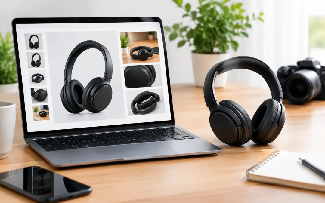
A shopper can decide whether to click your listing before reading a single bullet point. That is why Amazon image types are not just a creative decision. Each image has a job: earn the click, explain the product, answer objections, or make ownership feel easy.
For brands selling in a crowded search result, a clean image set can separate a product that looks credible from one that looks unfinished. The strongest listings use professional photography, accurate retouching, and a clear sequence that gives buyers the information they need without making them work for it.
Why Amazon image types affect listing performance
Amazon sellers generally have one main image and a series of secondary images. The main image must meet Amazon’s current category and marketplace requirements, while secondary images give brands more room to demonstrate benefits, dimensions, use cases, materials, and product details.
The goal is not to fill every available image slot with different versions of the same product shot. It is to build a visual sales presentation. A beauty product may need texture and ingredient callouts. A watch needs close detail, scale, and band information. Apparel needs accurate color, fit context, and fabric clarity. The right mix depends on what would prevent a buyer from adding the product to their cart.
Image requirements and permitted content can vary by category and marketplace, so sellers should always confirm the latest Amazon standards before production. Photography should be planned around those rules from the start, rather than edited around them later.
The essential Amazon image types for a stronger listing
1. The main image
The main image is your search-result image. It needs to make the product immediately recognizable at a small size and meet applicable Amazon requirements, which commonly include a pure white background, a clearly visible product, and no distracting text, graphics, props, or badges.
This image is where clean lighting and careful retouching matter most. Edges should look natural, labels should be readable, and colors should represent the actual item. If the product is sold as a set, the image should clearly show what the buyer receives. If a component is not included, do not create an image that suggests otherwise.
A technically compliant main image can still underperform if it feels flat, dark, poorly cropped, or visually confusing. Professional product photography gives the item shape, dimension, and clarity while keeping the presentation marketplace-ready.
2. The alternate product view
A single front-facing image rarely tells the whole story. Alternate angles show the side, back, top, bottom, interior, closure, connector, or other areas buyers expect to inspect. These images are especially valuable for electronics, bags, footwear, home goods, medical products, and tools.
Think about the questions a customer might ask if they were holding the product in a retail store. Where are the ports? How deep is the container? What does the back panel look like? Is the clasp secure? Alternate views reduce uncertainty and can cut down on avoidable returns caused by inaccurate expectations.
For products with multiple variations, keep the angle, crop, and lighting consistent. Consistency makes it easier for shoppers to compare colors, sizes, or styles without wondering whether the product itself has changed.
3. The detail or macro image
Detail images prove quality. They are where material texture, stitching, engraving, gemstone settings, finishes, seams, ingredient consistency, and small functional parts become visible.
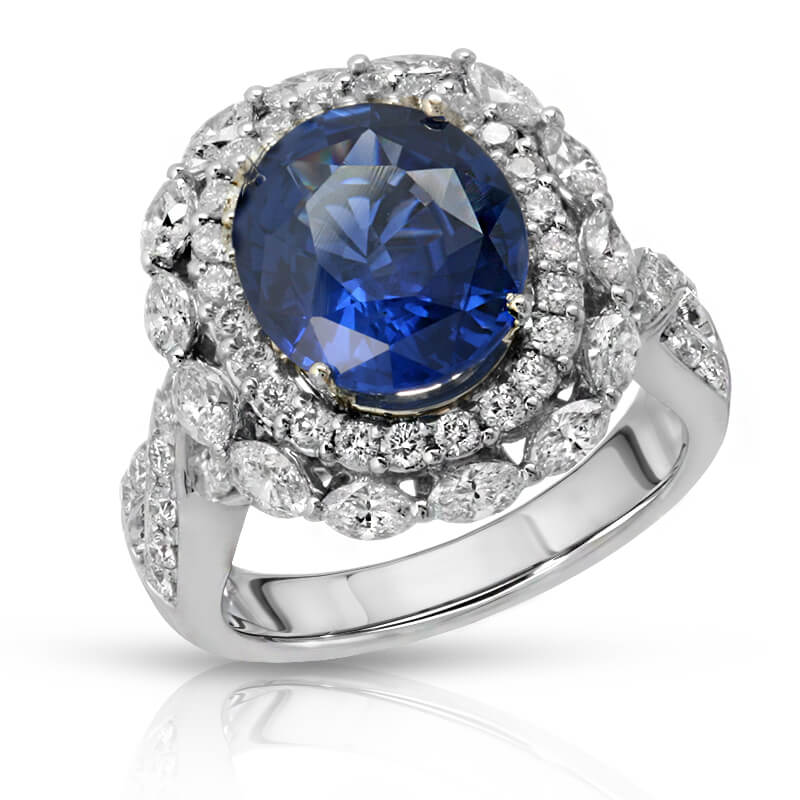
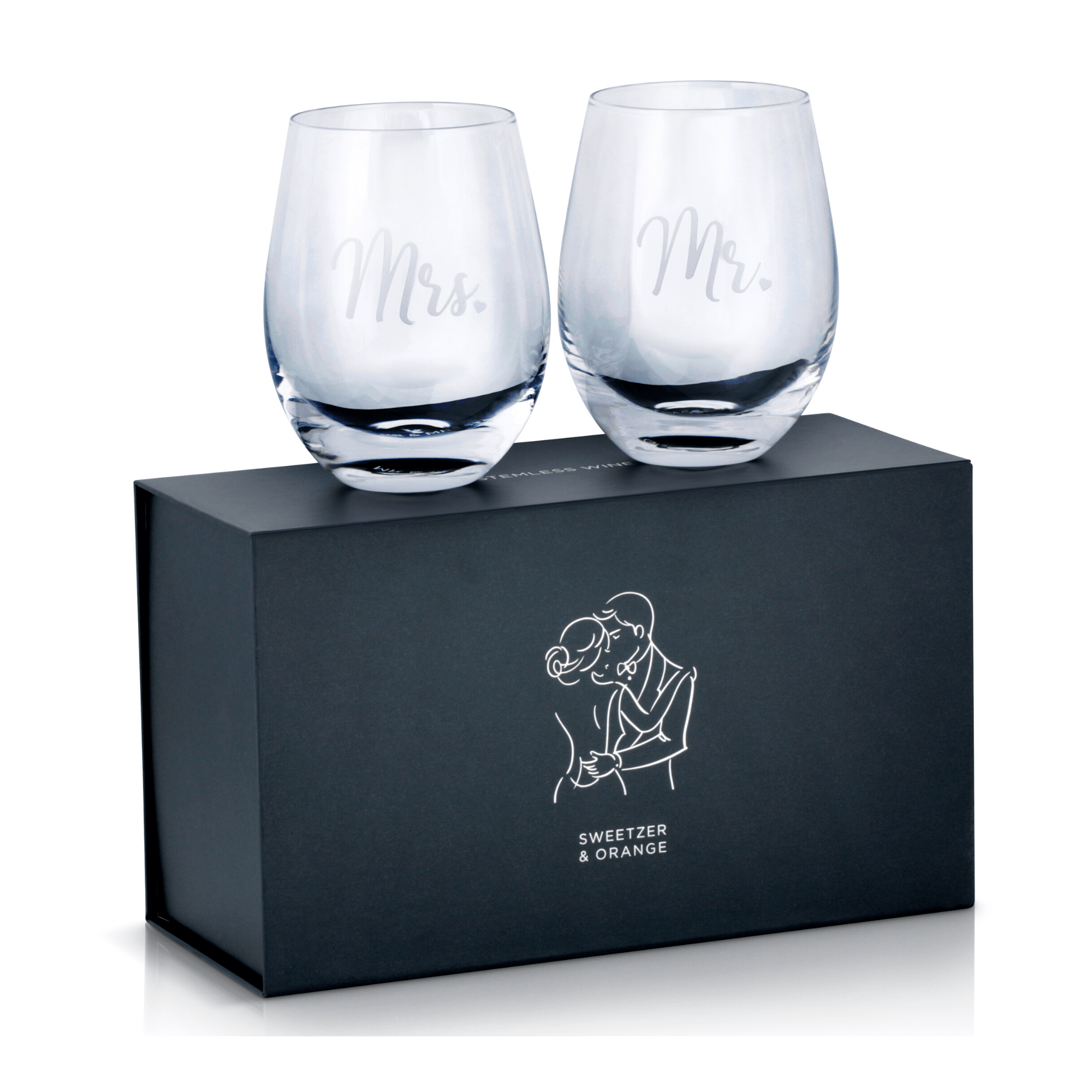
This is not simply a matter of zooming in. Macro product photography requires controlled lighting, focus, and retouching to preserve genuine texture without exaggerating flaws or changing the product’s appearance. Jewelry may need separate lighting for metal and stones. Glassware requires careful reflection control. Cosmetics need colors that remain true across screens.
Use detail images when the feature is a reason to buy. A close-up of a premium zipper, a soft fabric weave, a polished watch crown, or a precisely molded component gives a higher-value product tangible proof behind its claims.
4. The scale and dimensions image
Online shoppers cannot pick up the product, so dimensions alone are often not enough. A scale image helps them understand how large, small, tall, or compact an item really is. This is particularly useful for storage products, drinkware, kitchen tools, décor, toys, accessories, and portable electronics.
A dimensions graphic can show length, width, height, capacity, or weight in a quick visual format. Keep it simple. Too many measurements, arrows, and labels can become hard to read on mobile devices. The most useful graphic answers the size question in seconds.
Scale can also be shown through a hand, a model, or a familiar setting, provided the image remains clear and appropriate for the category. A 12-ounce bottle beside a hand often communicates more quickly than a line of small text.
5. The lifestyle image
Lifestyle photography shows the product in use and gives buyers context. It helps them picture the item in their routine, home, office, travel bag, vanity, or wardrobe. For products where emotion or aspiration matters, this can be the image that turns interest into purchase intent.
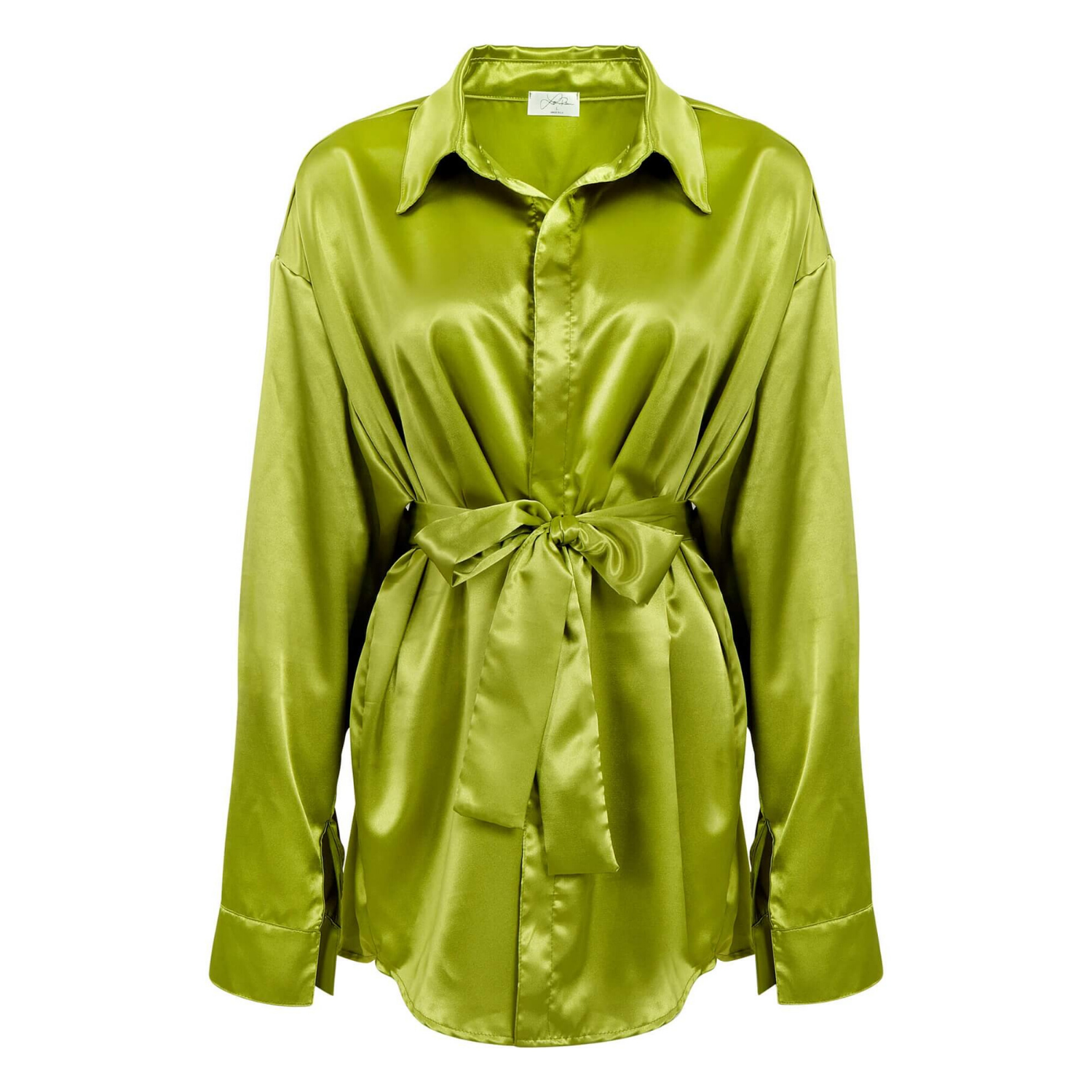
The setting should support the product rather than overpower it. A candle should look at home in a believable room. A beverage should feel refreshing without hiding the package. Apparel should show fit and movement while retaining accurate color. A lifestyle shot that is too dark, busy, or overly styled can make the product harder to evaluate.
For smaller brands, lifestyle imagery does not need a massive production budget to work. Thoughtful styling, clean art direction, and professional lighting can create polished scenes that feel credible and commercially useful.
6. The benefit infographic
An infographic image combines product photography with concise copy, icons, or callouts. It is often the best place to explain practical advantages that are difficult to see in a standard product shot: waterproof construction, key ingredients, compatibility, capacity, care instructions, or included accessories.
The trade-off is readability. If the image is packed with marketing language, shoppers will skip it. Use a strong product image, a short headline, and a small number of benefits that matter most. Make sure the statements are accurate, substantiated, and aligned with the claims allowed for your product category.
Infographics work well when they clarify a decision. They work poorly when they repeat information buyers can already see or rely on vague phrases such as “premium quality” without visual proof.
7. The comparison or “what’s included” image
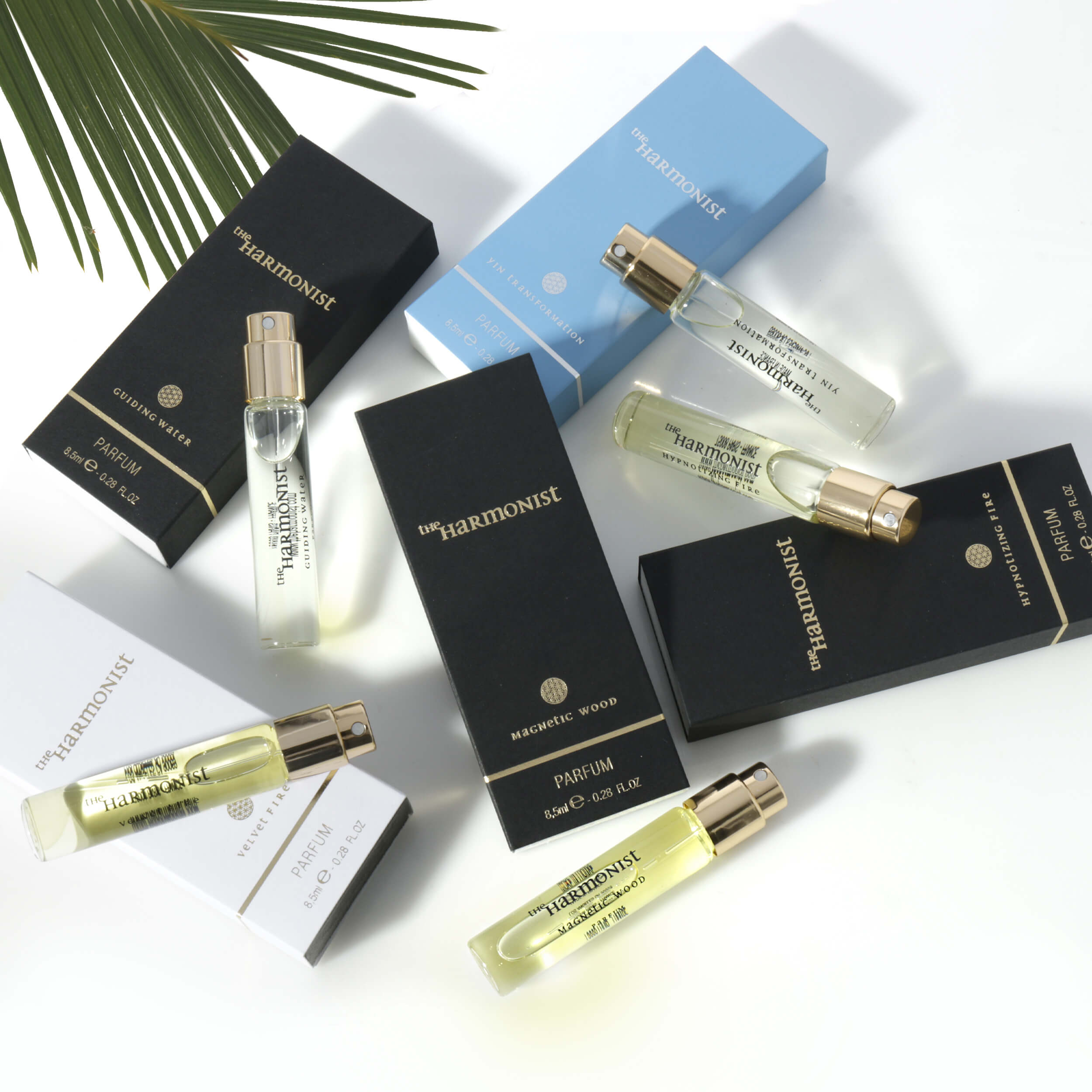
Some products need a direct explanation of their package contents or differences between models. A “what’s included” image is useful for bundles, kits, replacement parts, electronics, beauty sets, and products with multiple accessories. It helps buyers understand exactly what arrives in the box.
Comparison graphics can be effective for brands with several related products, but they need careful execution. The comparison should be fair, easy to scan, and focused on meaningful differences such as size, capacity, material, or primary use. Avoid cluttering the image with every feature from every model.
Build the image order around buyer questions
Image order matters because many shoppers will not view every photo. Place the highest-priority information near the front of the sequence. After the compliant main image, a typical order may move from alternate views to a key benefit, scale or dimensions, lifestyle use, detail photography, and package contents.
There is no single sequence that fits every product. A luxury necklace may lead with beauty, craftsmanship, and scale. A portable blender may need capacity, components, controls, and everyday use earlier in the gallery. Start with the objections that most often stop a purchase, then assign each image one clear task.
Before a shoot, create a shot list that includes required marketplace images, variation needs, product angles, detail requirements, props, models, and graphic space. Planning these decisions upfront saves reshoots and produces a more consistent listing across the full product line.
Make image quality match your product promise
Low-resolution files, inaccurate color, rough cutouts, and inconsistent backgrounds can make even a strong product look less trustworthy. This is especially costly when your product competes on quality, design, or price. Shoppers often use image quality as a shortcut for judging the brand behind the item.
Professional retouching should improve the presentation without misrepresenting what buyers receive. Dust, minor production marks, uneven lighting, and distracting reflections can be corrected. Product color, material, size, included items, and functional details should remain honest. That balance protects the customer experience and the brand’s long-term reputation.
At Product Photography Studio, we build high-resolution, conversion-focused image sets for Amazon sellers and ecommerce brands, with detail-oriented photography and polished retouching tailored to the product category. The result is not just a better-looking gallery. It is a clearer reason for shoppers to choose your product.
The best next step is to look at your listing as a first-time buyer would: identify the question each image answers, then replace any photo that does not make the purchase decision easier.