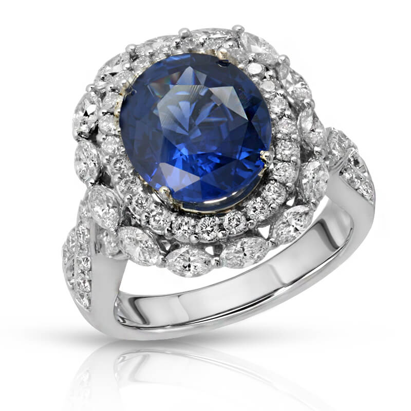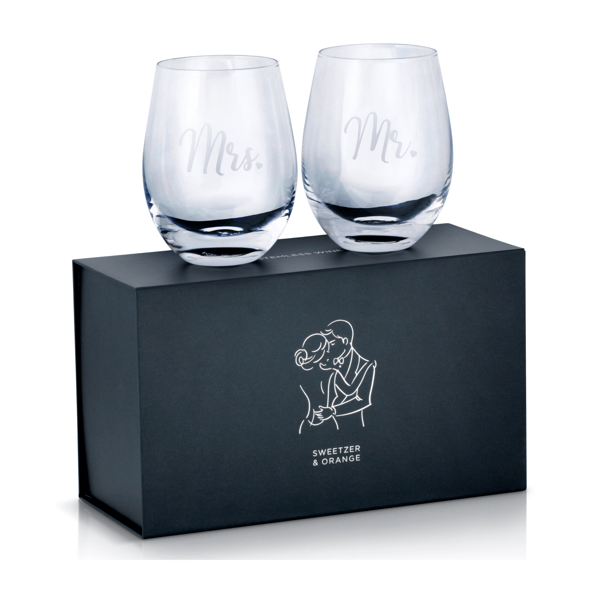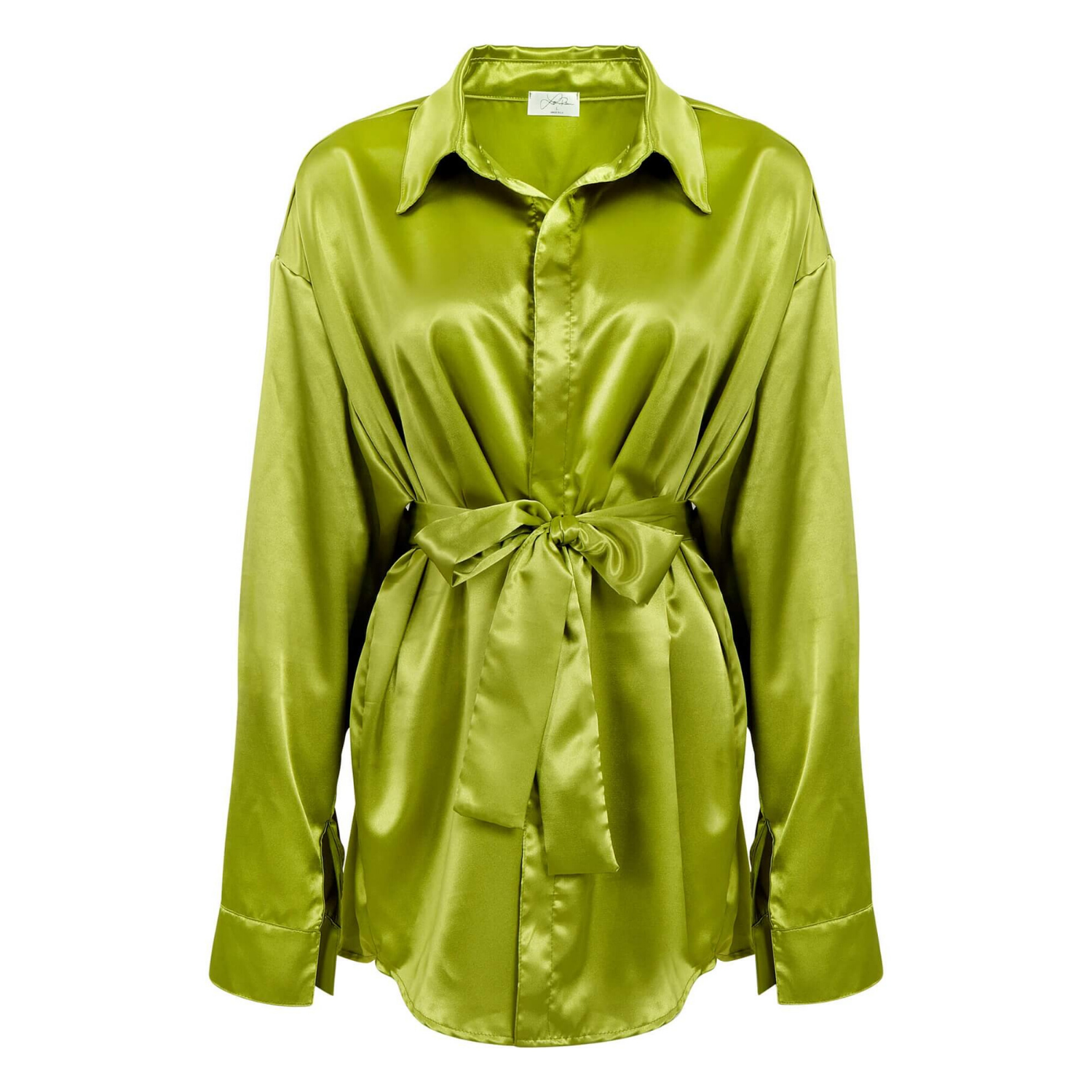
A shopper cannot pick up your product, inspect the finish, or compare its size in person. On an ecommerce listing, your images must do that work before the shopper reads a single bullet point. This ecommerce image conversion case study examines a common problem for online sellers: a solid product with weak visual presentation that was costing clicks, confidence, and sales.
The scenario is representative of the work ecommerce brands bring to a commercial product photography studio. The product category can vary – beauty, jewelry, electronics, accessories, home goods, or apparel – but the sales problem is often the same. Listings look inconsistent, the product is poorly lit, important details are hard to see, and customers hesitate before adding the item to their cart.
The Conversion Problem Behind Low-Quality Images
The brand in this case sold a mid-priced consumer product through its own ecommerce store and a major marketplace. The product had favorable reviews, competitive pricing, and a clear use case. Yet the listing was underperforming compared with similar products in the category.
Its original photography was created quickly with a basic setup. The hero image was technically usable, but it lacked contrast and definition. Product colors shifted from one image to another. Close-ups did not show the material quality, and the lifestyle image made the product appear smaller than it actually was. On mobile, where much of the traffic originated, the listing looked flat and easy to scroll past.
This is not simply a design issue. Ecommerce customers use images to answer practical buying questions: What exactly am I getting? Is this product well made? Is the color accurate? Will it fit my needs? Can I trust this seller? When photography does not answer those questions quickly, the customer either keeps searching or purchases from a competitor with a clearer presentation.
The brand did not need more images for the sake of filling gallery slots. It needed a planned image set that supported the purchase decision from first click to checkout.
Ecommerce Image Conversion Case Study: The Photo Strategy
The revised photography plan began with the product listing rather than the camera. Before shooting, the team identified the details that influenced purchase decisions: finish, dimensions, texture, scale, variations, and the product’s primary benefit. Those answers shaped the shot list.
The main image was photographed on a clean, marketplace-ready white background. Careful lighting separated the product from the background while preserving natural edges and accurate color. The goal was immediate recognition at thumbnail size, where many purchase decisions begin.
Secondary images were assigned specific jobs. One image focused on material detail. Another showed scale in a realistic setting. A close-up highlighted a feature that justified the product’s price point. An angle view clarified depth and construction. If the product came in multiple colors or configurations, each variation was photographed consistently so the listing felt organized and credible.
For an apparel or accessory brand, this might mean front, back, detail, and fit images with color-accurate retouching. For a jewelry seller, it may mean multiple angles that reveal stone sparkle, metal finish, clasps, and true proportions. A skincare brand may need texture photography, packaging details, and an application image that remains compliant with marketplace guidelines. The exact mix depends on the product, but every image should reduce a specific form of buyer uncertainty.
Professional retouching was also central to the result. Retouching did not mean changing the product into something it was not. It meant removing dust, correcting distracting reflections, refining edges, balancing exposure, and maintaining consistent color across the complete image set. For ecommerce, accuracy matters as much as polish. Over-edited images may earn a click, but inaccurate color or misleading detail can lead to returns and negative reviews.
What Changed in the Customer Experience
After the updated image set replaced the original photography, the product page became easier to understand at a glance. The main image looked stronger in search results and category pages. The gallery gave customers a complete view of the product instead of forcing them to guess about features, texture, or scale.
That distinction matters because conversion is rarely driven by one photograph alone. The hero image earns the click. Detail images validate quality. Scale images set expectations. Lifestyle photography provides context. Consistent visual direction builds trust across the gallery, storefront, and advertising creative.
In a controlled comparison, the brand should monitor product-page conversion rate, add-to-cart rate, image engagement, return rate, and conversion by device. Click-through rate is especially useful for marketplace listings and paid ads, while add-to-cart rate can reveal whether the new imagery is addressing concerns after shoppers land on the page.
A realistic result is not that photography fixes every performance issue overnight. Pricing, reviews, shipping speed, inventory availability, product-market fit, and page copy still affect sales. But when a listing has a competitive offer and weak images, professional photography can remove one of the largest barriers between product discovery and purchase.
Why the Image Set Outperformed the Original
The improved result came from visual merchandising, not from a single editing trick. The new photographs made the product more legible, more desirable, and more believable.
First, the product was easier to identify quickly. Clean lighting and a clear silhouette helped it stand out against competing search results. This is especially important on Amazon, Google Shopping, and mobile category pages, where shoppers view many similar items in seconds.
Second, the images showed evidence of quality. Fine details, materials, finishes, and construction are difficult to communicate through copy alone. A well-executed close-up can support a premium price more effectively than another paragraph of product description.
Third, the gallery created consistency. A mismatched mix of customer snapshots, supplier images, and rushed in-house photos can make even a good product look unreliable. Consistent backgrounds, color treatment, framing, and retouching give a brand a more established commercial presence.
Finally, the revised images set clearer expectations. A product that looks different in person than it did online may generate returns. Accurate color, honest texture, and useful scale references help attract customers who understand what they are buying.
The Trade-Off: More Images Are Not Always Better
A larger gallery is not automatically a stronger gallery. Repeating the same angle five times can create friction rather than confidence. Every image should earn its place by answering a new question or showing a meaningful product benefit.
The right number of images depends on the category and selling channel. A simple office supply item may need a polished hero image, a detail view, dimensions, and a use-case image. A high-consideration beauty product, watch, or premium accessory may require a deeper visual story. Marketplace rules also affect image requirements, background standards, text overlays, and acceptable lifestyle content.
Budget is another practical consideration. Brands with large catalogs often need a scalable approach that balances image quantity, production value, and turnaround time. The answer may be a core set of conversion-focused images for every SKU, with expanded lifestyle or campaign photography reserved for best sellers, launches, and paid advertising.
How to Apply This Case Study to Your Listings
Start by reviewing your current listings as a shopper would. Look at the hero image at thumbnail size, then on a mobile screen. Ask whether the product is immediately clear, whether color looks consistent, and whether the image gallery answers the questions a buyer would have before purchasing.
Next, identify the objections that images can solve. If buyers ask about size, photograph scale. If they question quality, show material details. If the product is available in several finishes, photograph each one accurately. If use is unclear, create a lifestyle or in-use image that makes the benefit understandable within seconds.
Then build a shot list before production begins. A professional product photography process is faster and more cost-effective when the required deliverables, angles, marketplace specifications, and retouching expectations are defined upfront. This is particularly valuable for brands managing multiple SKUs or preparing a catalog, seasonal launch, or new Amazon listing.
Product Photography Studio helps sellers create high-resolution, professionally retouched product imagery designed for ecommerce, marketplaces, catalogs, and advertising. With pricing starting as low as $12 per image, brands can improve visual consistency without taking on the expense of an in-house studio.
The best next step is not to replace every image at once. Start with the listings that have strong demand, weak conversion, or the highest revenue potential. A sharper hero image and a gallery built around real buyer questions can give your product a better chance to earn the click – and the sale.