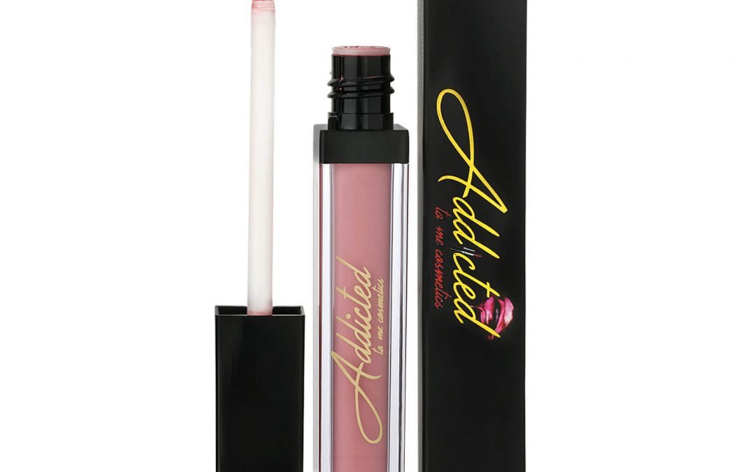
A lipstick tube can look premium in person and cheap in a product photo for one simple reason: the lighting does not show its true finish. Learning how to light cosmetic products means controlling shine, color, texture, and reflections so shoppers can see exactly what they are buying. For ecommerce listings, Amazon product pages, beauty campaigns, and catalogs, that clarity directly affects confidence, clicks, and sales.
Cosmetics are deceptively difficult to photograph. A glossy compact can reflect everything in the studio. A clear serum bottle can disappear against a white background. Metallic eyeshadow can turn gray, while a nude foundation can shift warmer or cooler than the actual product. The goal is not simply to make the product bright. The goal is to make it look clean, desirable, color-accurate, and consistent across every SKU.
Start With the Cosmetic Product’s Surface
The right lighting setup depends on what the packaging and formula are made of. Before placing a light, identify the dominant surface: matte, glossy, metallic, translucent, clear glass, or a mix of several materials. Each surface needs a different approach.
Matte cartons, powder compacts, and velvety lipstick tubes usually respond well to broad, soft light. This creates even coverage without harsh shadows or distracting hotspots. It also holds detail in embossed logos, subtle package textures, and printed copy.
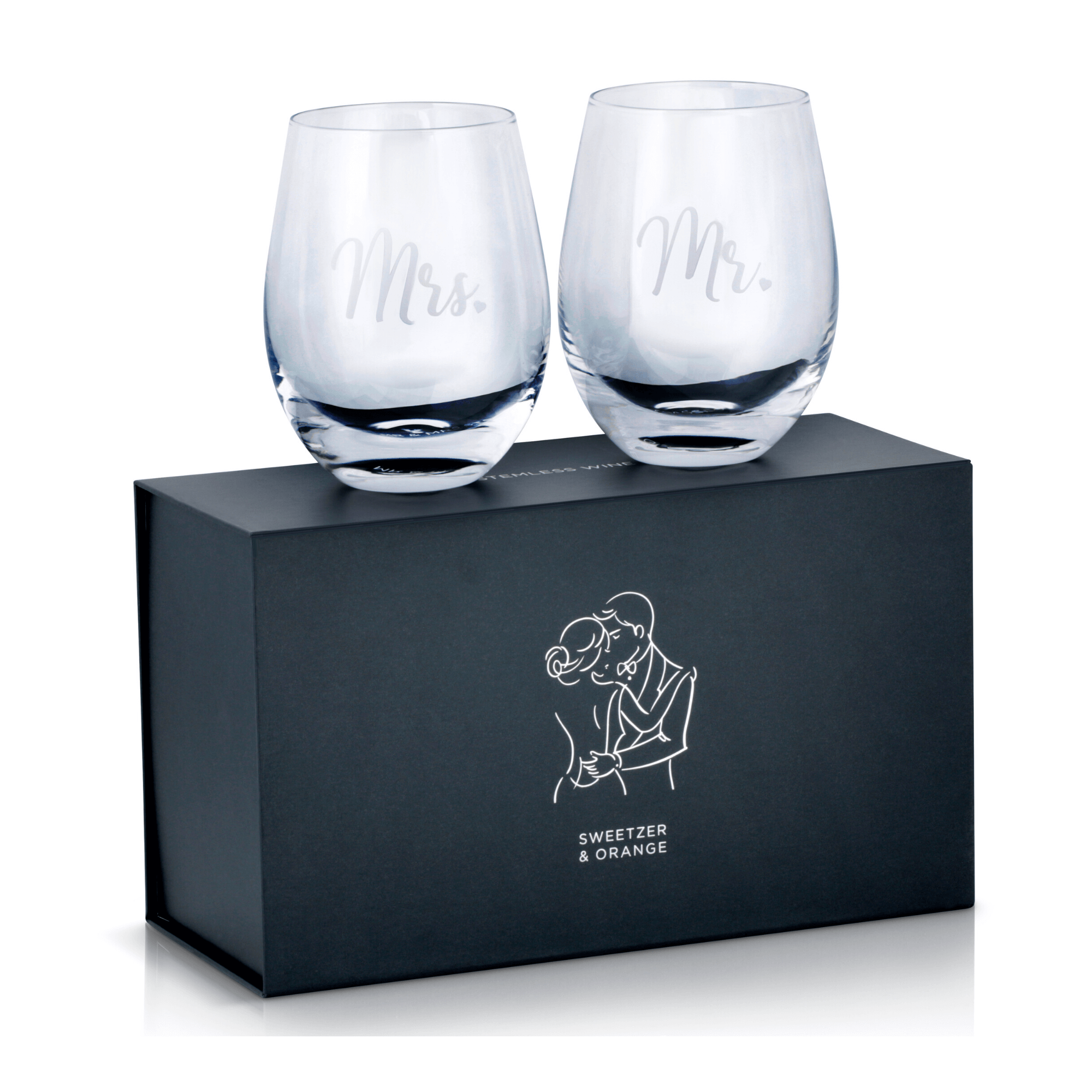
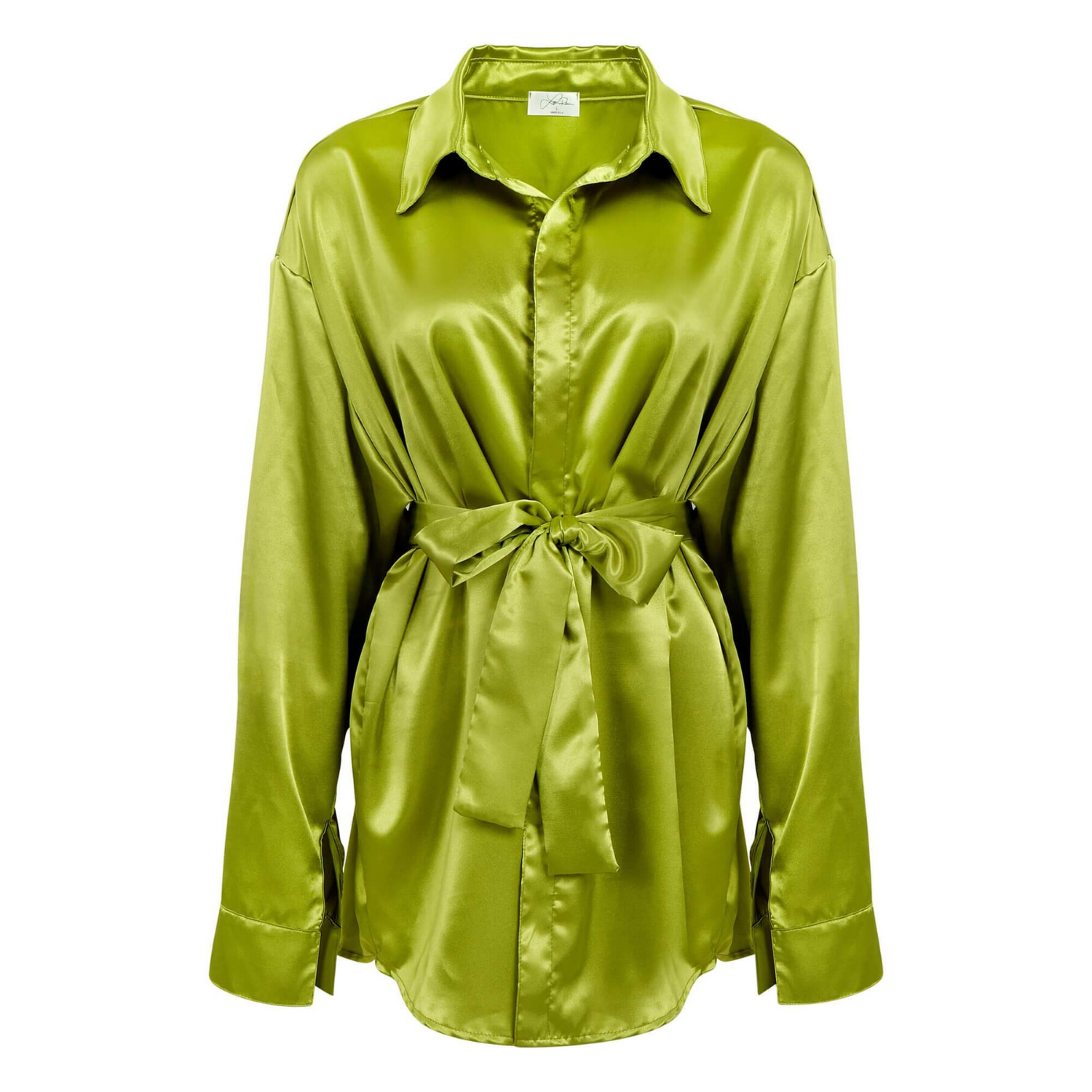
Glossy tubes, lacquered compacts, and reflective caps need more control. These products will reflect the shape of the light source, the room, and even the photographer. In these cases, lighting is often less about pointing light at the product and more about positioning large white or black surfaces that create attractive reflections.
Clear glass and translucent bottles present another challenge. If you light them only from the front, they can look flat and lose their edges. Backlighting or side lighting helps define the bottle shape, show the liquid inside, and separate it from the background.
How to Light Cosmetic Products With a Clean Base Setup
For standard ecommerce images, begin with a large soft key light placed above and slightly in front of the product. A softbox, diffusion panel, or light tent can create the broad, gentle illumination that beauty packaging needs. Position the light around 30 to 45 degrees from camera axis rather than directly beside the lens. This gives the product dimension while keeping shadows controlled.
Use a white bounce card on the opposite side to fill in deep shadows. The card is a simple but valuable tool for revealing label detail and maintaining a clean, commercial look. Move it closer when the shadow side is too dark, and farther away when the image begins to look flat.
A small amount of separation light can help when photographing darker packaging, black tubes, or products against a white background. Place a light behind or slightly to the side of the product, then flag it carefully so it does not spill into the lens. This produces a refined edge highlight that separates the product from the background without making it look over-lit.
For most catalog-ready images, a white sweep or seamless background is the practical choice. Keep it bright, but do not let it overpower the subject. A pure white background with weak product detail is not a successful product photo. Exposure should preserve the product’s color, text, and surface quality first, then bring the background to the required white level in post-production.
Control Reflections Instead of Fighting Them
Reflections are not always a problem. On a high-gloss lipstick case or metallic fragrance cap, a well-shaped reflection can communicate quality. The problem is uncontrolled reflection – bright circles, room clutter, blown-out highlights, or random dark marks that distract from the product.
The size of the light source determines the size and softness of its reflection. A small bare light creates a hard, concentrated hotspot. A large diffused source creates a wider, smoother reflection. For glossy cosmetics, large diffusion panels are often more useful than stronger lights.
Black foam board is equally valuable. Place it just outside the frame to create a dark edge or line on chrome, glass, and glossy plastic. This is called negative fill. It gives reflective surfaces definition, especially when the product is surrounded by white surfaces and begins to lose its shape.
The exact placement matters. Move a card or diffuser in small increments, watching the product through the camera. A shift of an inch can change the highlight on a curved compact or bottle. This is why professional cosmetic photography takes careful styling and adjustment, not just a quick light-tent setup.
Light Makeup Swatches and Open Products Differently
A closed product package sells the brand and the item. An open compact, exposed lipstick bullet, cream jar, or makeup swatch also has to sell the texture and payoff. These images need more directional light than a standard packshot.
Position a soft key light at an angle that allows texture to show without producing deep, unflattering shadows. For powder pans and pressed highlighters, light from the side can reveal embossing and shimmer. For cream formulas, use a broad source to retain a smooth, fresh appearance while controlling shiny peaks.
Swatches need accurate color and visible finish. Use a neutral white balance, and avoid mixing window light with flash or continuous lights. Mixed light sources can create color casts that make a warm blush look orange or a cool lipstick look purple. If the brand needs a true shade reference, color accuracy is not optional.
For shimmer, glitter, and metallic formulas, the angle of incidence matters. Rotate the product or change the light position until the shimmer catches the light in a controlled way. Too little directional light makes the formula look dull. Too much can create bright specular points that hide the actual shade.
Keep Color Accurate From Capture Through Retouching
Beauty customers expect the product shade shown online to closely match what arrives in the mail. While screens and individual device settings will always vary, proper capture reduces preventable color problems.
Use lights with a high color rendering quality and keep the same light source throughout the shoot. Set a custom white balance instead of relying on automatic settings, especially for foundations, concealers, blushes, and lip colors. Include a color reference target at the start of each setup so the image files can be corrected consistently during editing.
Shoot in RAW when possible. RAW files preserve more information in highlights and shadows, providing more flexibility when refining exposure and matching product color. This is useful with white cosmetic packaging, where labels and surfaces can lose detail quickly, and with black packaging, where shadows can block up.
Retouching should clean dust, fingerprints, minor scratches, uneven reflections, and packaging imperfections without changing the product into something it is not. Over-retouching is a risk in beauty imagery. If a glossy tube becomes plastic-looking or a lipstick shade is altered for visual impact, the image may win attention but create returns and disappointed buyers.
Build Consistency Across a Full Cosmetic Line
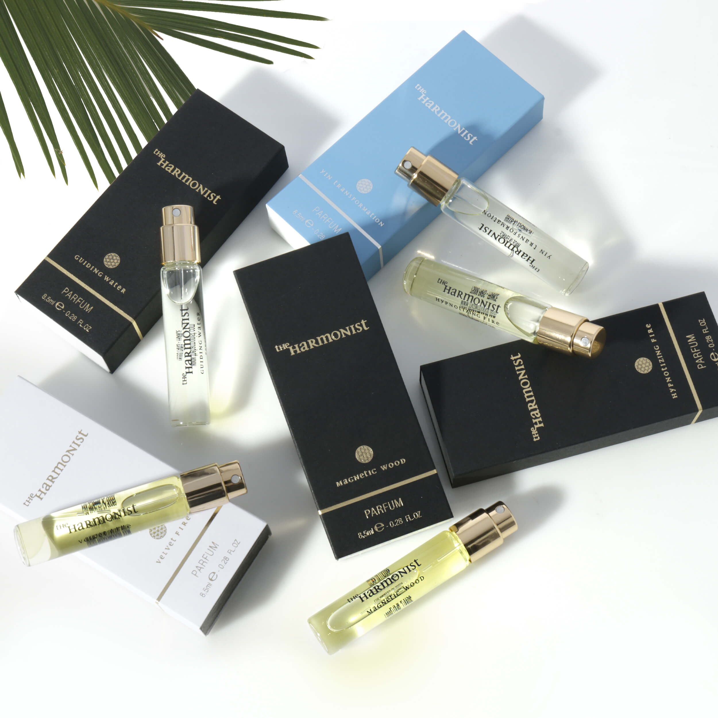
A single hero image can tolerate a more creative setup. A collection of 30 lip products, skin care bottles, or makeup palettes needs repeatable lighting. Consistency makes a brand look established and helps customers compare colors, sizes, and formats without visual confusion.
Lock the camera position, focal length, product distance, key-light position, and background treatment once the approved look is established. Mark the placement of stands, cards, and the product platform with tape. Record exposure settings and any special reflection-control notes for each packaging type.
This does not mean every item should be lit identically. A frosted serum bottle and a mirrored compact may need different modifiers. The standard should be consistent visual results: clean background, readable branding, accurate color, controlled highlights, and matching shadow direction.
For brands selling across Amazon, their own website, retailer portals, print catalogs, and paid advertising, it also helps to plan the shot list before production. White-background main images, alternate angles, open-product images, ingredient or texture details, and lifestyle-ready hero shots all serve different selling purposes. Capturing them in one organized session is more efficient than rebuilding the set later.
Common Cosmetic Lighting Mistakes That Cost Sales
The most common mistake is lighting every product with the same front-facing setup. It may be fast, but it often leaves glass bottles flat, metallic packaging dull, and glossy finishes covered in ugly glare. Another frequent issue is using harsh direct light to create contrast, then losing label readability and true product color.
Poor preparation is also visible in the final file. Dust on black packaging, fingerprints on glass, crooked labels, chipped edges, and smudged caps become more obvious under studio lights. Clean every product carefully, use gloves when needed, and inspect the image at full resolution before moving to the next SKU.
Finally, do not treat post-production as an afterthought. Clean photography starts on set, but professional retouching is what turns a technically good capture into a polished commercial asset. It protects consistency across a product line and ensures the finished files meet marketplace and print requirements.
For a small launch, a controlled DIY setup can be enough. For a large SKU count, reflective packaging, exact shade matching, or retailer-ready deliverables, professional production is often the more cost-effective decision. Product Photography Studio combines category-specific lighting, detail-focused retouching, and fast commercial delivery to help beauty brands present every product at its best.
The strongest cosmetic image makes shoppers pause long enough to inspect the finish, trust the shade, and picture the product on their own shelf. Light for that decision, not just for brightness.