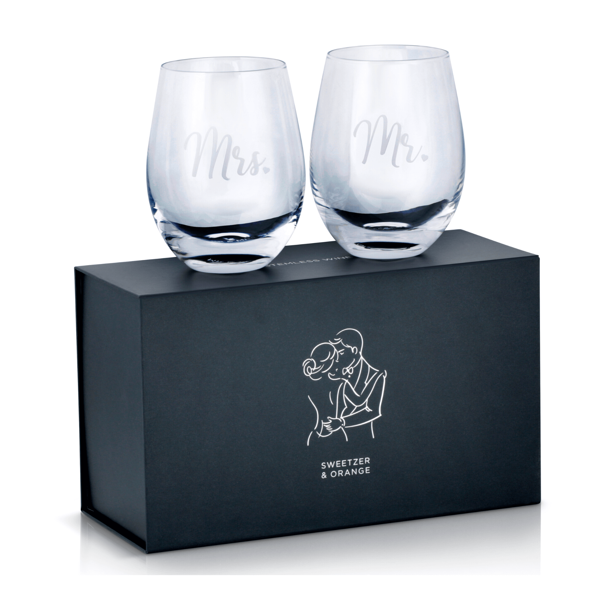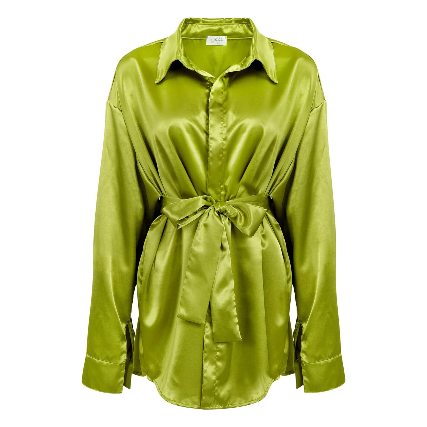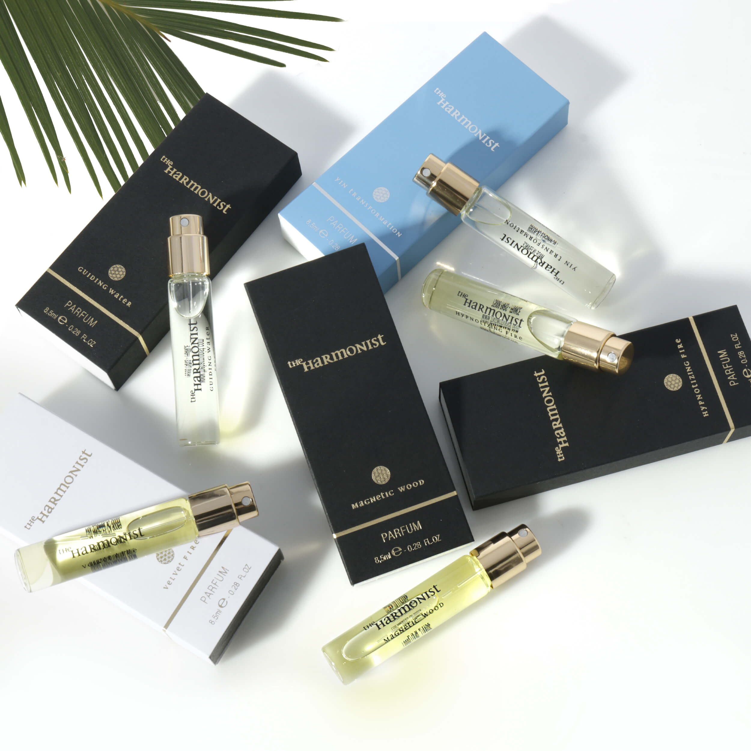
A+ Content gives shoppers more space to evaluate your product, but more space does not automatically create more sales. The best images for Amazon A plus make the buying decision easier: they show what the product is, why it is worth choosing, how it works, and where it fits in a customer’s life. Every image should answer a question that could otherwise cause hesitation.
For Amazon sellers, that means treating A+ imagery as sales material, not as a gallery of attractive photos. A beautiful image without a clear job can waste valuable page space. The right sequence of professionally lit, accurately retouched visuals can reinforce your listing copy, reduce uncertainty, and give shoppers a stronger reason to click Add to Cart.
What Makes the Best Images for Amazon A Plus?
The most effective A+ images combine visual quality with a clear commercial purpose. They are sharp, consistent with your brand, and designed around the information a buyer needs before purchasing. Product details, scale, materials, usage, packaging, and comparisons all matter, but not every product needs the same mix.
A watch buyer may need close-up images of the dial, clasp, finish, and dimensions. A beauty customer may want to see texture, key ingredients, application, and product size. For electronics, compatibility, ports, setup, and real-life use often carry more weight than lifestyle alone. The image plan should follow the product category and the likely objections behind a purchase.
Amazon’s available A+ modules and image requirements can change by template and marketplace, so design should begin with the module layout you plan to use. Do not force a horizontal lifestyle photo into a format built for a detail callout. Planning images for their final placement prevents awkward crops, unreadable text, and inconsistent presentation.
Start With the Main Product Story
Your first major A+ visual should immediately establish the product’s strongest value. This is usually not a repeat of the main listing image on white. Instead, use a refined product-in-context shot or a branded hero image that makes the benefit feel specific and believable.
For example, a premium insulated bottle can be photographed in an active everyday setting, while close visual callouts show its leak-resistant lid, durable finish, and carry loop. The product remains the focal point, but the scene helps shoppers understand its role. A cluttered background, vague props, or a lifestyle scene that hides the product will dilute the message.
Keep the visual hierarchy simple. The product should read first, the benefit second, and the brand styling third. When everything competes for attention, shoppers absorb less.
Use Detail Images to Prove Quality
Close-up photography is one of the highest-value assets in A+ Content, especially for products where materials and craftsmanship influence price perception. High-resolution detail images can show stitching, texture, metal finishes, gemstone facets, labels, controls, seams, and other features that are difficult to communicate in copy alone.
These images need precise lighting and professional retouching. Jewelry should show sparkle without losing the true appearance of the metal or stone. Apparel needs accurate color and fabric texture. Glassware and reflective electronics require controlled highlights so they look clean rather than distorted. Poorly managed reflections and inaccurate color can lower trust quickly.
The goal is not to make the product look artificially perfect. It is to present it clearly, consistently, and at a quality level that supports the price point. Shoppers notice when an image feels unreliable, even if they cannot explain why.
Build an A+ Image Sequence Around Buyer Questions
A+ Content works best when its images move shoppers from interest to confidence. Think through the questions someone asks after reaching the listing: What do I get? How big is it? What makes this better? Will it work for my situation? Is this brand credible?
A strong image sequence generally addresses those questions in a logical order. The exact number of images depends on the A+ layout, but the following content types earn their place when they provide new information:
- A hero image that establishes the product and primary benefit.
- Feature-focused images that show materials, construction, or performance details.
- A scale or dimension image that removes uncertainty about size and fit.
- A lifestyle image that demonstrates realistic use or the intended customer.
- A comparison image that helps shoppers distinguish product versions or models.
Do not repeat the same angle with slightly different backgrounds. Repetition can make a listing look polished, but it does not necessarily make it more persuasive. Each image should add a distinct piece of decision-making information.
Show Scale Before Shoppers Have to Guess
Scale is a common source of returns and negative feedback across categories. Small accessories can look larger online than they are. Kitchen products, storage goods, beauty items, and electronics can all create incorrect assumptions when dimensions are buried in the description.
A clear scale image solves this without relying on dense text. Show the item beside a relevant, familiar object, in a model’s hand when appropriate, or within the intended environment. For apparel and wearable accessories, show fit from more than one useful view. For products with measurements that matter, simple, legible dimensional graphics can work well.
The trade-off is that dimension graphics must stay clean. Trying to label every feature in one image creates visual noise, particularly on mobile screens. Use only the measurements that affect the purchase decision.
Make Lifestyle Images Specific, Not Generic
Lifestyle photography can make a product more desirable, but only when the setting supports a real product benefit. A generic desk, kitchen, or outdoor scene may look pleasant without explaining anything. A specific scene shows the item being used in a way that makes its value obvious.
A compact organizer should demonstrate how it improves a crowded workspace. A travel accessory should show portability and access in transit. A skincare product can show the product in a clean routine context, while remaining careful not to make unsupported claims. The setting should feel attainable and relevant to the target buyer.
For many products, one excellent lifestyle image is more effective than several weak ones. If your product has technical details, limited visual differentiation, or a highly practical use case, prioritize feature proof over excessive lifestyle content.
Use Text on Images With Restraint
A+ images often include short headlines and feature callouts. This can be useful because shoppers scan faster than they read, particularly on mobile. However, text should support the photograph, not cover it.
Use concise benefit-led language. “Scratch-resistant finish” is easier to process than a full paragraph about the manufacturing process. Keep type large enough to read, leave sufficient contrast behind it, and avoid placing important text near the edges where a module crop may interfere.
Be careful with claims. Statements about results, performance, certifications, health outcomes, rankings, or comparisons must be accurate and compliant with Amazon policies. Your images should build confidence without creating a compliance problem that delays publication or requires expensive revisions.
Keep Brand Presentation Consistent Across the Listing
A+ Content should feel connected to the main image set, storefront, packaging, and other customer touchpoints. Consistent color treatment, lighting style, prop choices, and typography make a brand appear established. This matters for newer sellers, where customers may have little familiarity with the company behind the listing.
Consistency does not mean every image needs the same background. It means the images belong together. A premium beauty brand may use soft, clean styling and controlled color. A technical accessory brand may need crisp lighting, precise detail shots, and a more functional visual system. The brand look should reinforce the position you want to own.
At Product Photography Studio, we plan commercial product photography around the final selling environment. That includes clean product shots, color-accurate retouching, detail photography, and lifestyle imagery built to support ecommerce and Amazon presentation. Good production planning also reduces reshoots, speeds approval, and gives your marketing team more usable assets beyond one listing.
Invest Where the Product Needs Proof
Not every Amazon listing needs elaborate sets or highly produced lifestyle campaigns. A simple household item may convert best with clean feature photography, scale, and clear benefits. A luxury accessory, beauty product, or giftable item may need more sophisticated styling to support its perceived value. The right production level depends on your category, price point, competition, and brand position.
What should not be compromised is clarity. Accurate color, clean lighting, thoughtful composition, and retouching that protects product integrity are the foundation of every effective A+ image set. When your visuals make the product easy to understand and easy to trust, shoppers can spend less time comparing and more time buying.
Before your next A+ update, review every image with one practical question: does this help a customer make a confident decision? If the answer is no, replace it with an image that does.