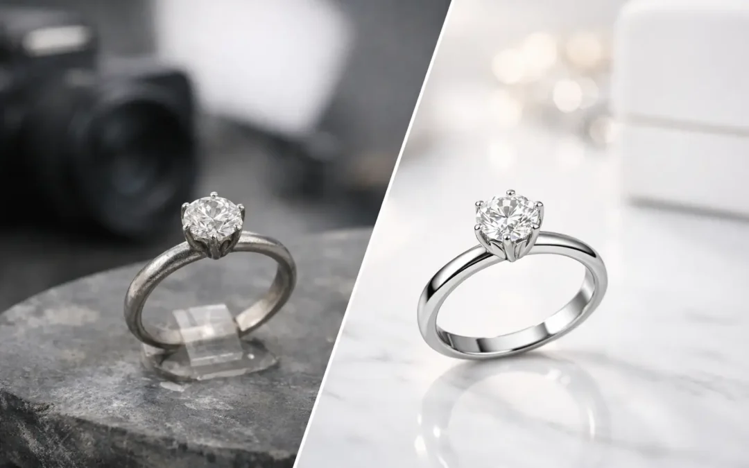
A jewelry listing can lose a buyer in seconds when the metal looks dull, the stone appears dark, or a clasp is hidden in shadow. The strongest jewelry photography before after examples do not simply show a prettier final image. They show how controlled lighting, careful styling, and precise retouching turn a difficult product into a clear reason to buy.
For ecommerce brands, Amazon sellers, and jewelry makers, that difference affects more than appearance. It affects perceived value, shopper confidence, click-through rate, and whether a customer feels comfortable purchasing a high-consideration item without seeing it in person.
What Jewelry Photography Before After Examples Reveal
Jewelry is one of the least forgiving product categories to photograph. Polished metals reflect the room, gemstones can turn black when they are underlit, and tiny pieces can look flat if the camera angle is even slightly wrong. A raw capture may accurately document the item, but it rarely presents the item at its best.
A professional after image should still be truthful. The goal is not to create a ring, necklace, or bracelet that does not exist. The goal is to remove distractions created by the photography process and present the real product with clean color, visible detail, and a consistent selling standard.
That distinction matters. Heavy editing that changes a stone’s color, alters the size of a diamond, or removes natural inclusions can create returns and damage trust. Commercial retouching works best when it corrects reflections, dust, minor surface marks, uneven background tones, and lighting limitations while preserving the actual product.
5 Before and After Examples That Improve Listings
1. A silver necklace with dark, distracting reflections
Before retouching, a sterling silver necklace often picks up dark bands from the camera, studio equipment, or surrounding room. The chain may blend into a gray background, and the pendant can look more like chrome than silver. Even if the piece is well made, those reflections make it feel cold and inexpensive.
After a controlled jewelry shoot, the silver has clean highlight lines that define its shape without turning the surface into a mirror. The chain is separated from the background, the clasp is visible where needed, and the pendant’s texture reads clearly. The product has not been changed – the visual noise has been removed.
This is especially valuable for marketplace thumbnails. At a small size, a necklace with unclear edges can disappear. A well-lit, retouched image gives the buyer an immediate read on the silhouette and finish.
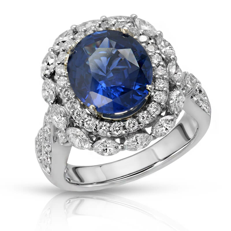
2. A diamond ring with a black-looking center stone
A common before image of a diamond ring shows a bright metal setting and a center stone that looks unexpectedly dark. This happens because faceted stones reflect their environment. If the lighting and camera position are not managed carefully, the lens itself can become the dominant reflection inside the diamond.
The after image uses thoughtful light placement to reveal the stone’s facets, setting details, and overall brilliance. Retouching can clean dust and reduce minor visual distractions, but the best result starts in-camera. Trying to manufacture sparkle entirely in post-production usually looks artificial.
There is a trade-off here. A ring image filled with extreme flashes may look dramatic on social media, but it can hide the shape and quality of the stone. For a product page, buyers need a balanced image that shows brilliance while allowing them to inspect the setting, prongs, and metalwork.
3. Yellow gold earrings with inaccurate color
Gold is easy to misrepresent. Poor white balance can make yellow gold appear green, overly orange, or washed out. Mixed lighting is often the problem, particularly when a product is photographed near a window, under household bulbs, or with low-cost continuous lights.
In a strong after image, yellow gold looks warm and rich without becoming orange. White gold stays neutral, and rose gold retains its distinctive blush tone. Accurate color is not a minor production detail when customers are choosing between metal options or trying to match pieces they already own.
For brands selling multiple finishes, consistency is equally important. If yellow gold earrings are photographed in one style and a matching necklace is photographed under different lighting, the collection can look mismatched even when the products are identical in person. A standardized studio process protects the brand presentation across every SKU.
4. A gemstone bracelet with no visible texture or depth
Gemstones need lighting that respects their individual character. A before photo of an emerald, sapphire, opal, or turquoise bracelet can look overly dark, too pale, or flat enough that every stone appears the same. This is often caused by lighting a piece only from the front, with no separation to reveal facets, cabochon shape, or surface texture.
The after version should make the bracelet easier to evaluate. Stones show their color range, metal settings are distinct, and the product retains realistic texture. A quality image may reveal slight natural variation between stones, which is often a selling point for genuine gemstones and handmade jewelry.
The right approach depends on the product. A highly faceted sapphire benefits from controlled sparkle and edge definition. An opal requires a setup that captures its play of color without blowing out bright areas. A matte turquoise piece needs texture and accurate hue more than high-contrast shine. One lighting recipe will not serve every jewelry category.
5. A full jewelry collection photographed without consistency
Sometimes the most telling before and after example is not a single image. It is an entire collection. Before professional photography, a brand may have rings photographed on white, earrings on gray, necklaces with warm shadows, and bracelets cropped at different scales. Each photo may be acceptable alone, but the storefront feels unorganized when viewed together.
After a consistent commercial shoot, the collection has a shared visual system. Backgrounds match, product scale makes sense, shadows are intentional, and crops support the same merchandising layout. Customers can compare products quickly, while marketing teams have dependable assets for product pages, ads, catalogs, email campaigns, and print.
That consistency also makes new products easier to add. Rather than rebuilding the visual approach every time a new style launches, brands can maintain an established image standard as their catalog grows.
What Happens Between the Before and After
The visible change comes from a process, not a filter. Jewelry is inspected and cleaned before photography because lint, fingerprints, and dust become obvious at high resolution. Pieces are then positioned to show their strongest angle, whether that means a front-facing ring, a necklace arranged in a clean curve, or earrings displayed to reveal both shape and fastening.
Lighting is built around the product’s material. Highly polished metal needs controlled reflections. Diamonds and faceted gems need dimensional light. Pearls need soft highlights that communicate luster without losing their subtle surface. The camera, lens, support, and composition also matter because small movements can change how a stone or metal surface appears.
Post-production then refines the image for commercial use. Typical work includes background cleanup, dust removal, color correction, edge refinement, reflection control, and careful detail enhancement. For some brands, image clipping or transparent-background files are needed for marketplaces and design layouts. For others, a natural shadow on white creates a more premium catalog look.
How to Judge a Professional After Image
A polished result should make the product easier to understand, not harder to believe. Check whether the metal color looks natural, gemstone details remain visible, and important construction details are clear. Look closely at edges, prongs, chains, clasps, engravings, and symmetry. These areas reveal whether the work was handled with care.
Also consider the image’s job. Amazon-ready images often require a pure white background and precise product coverage. A direct-to-consumer collection may benefit from clean white primary images plus editorial detail shots and on-model photography. A wholesale line sheet needs consistent scale and accurate color above almost everything else.
The best jewelry photography program supports each of those needs without sacrificing the product’s integrity. At Product Photography Studio, the focus is on high-resolution jewelry images that look polished, consistent, and ready to support sales across your chosen channels.
If your current photos make fine jewelry look ordinary, start with a side-by-side test on a few key products. The right before-and-after difference will be visible before the customer ever reaches the add-to-cart button.