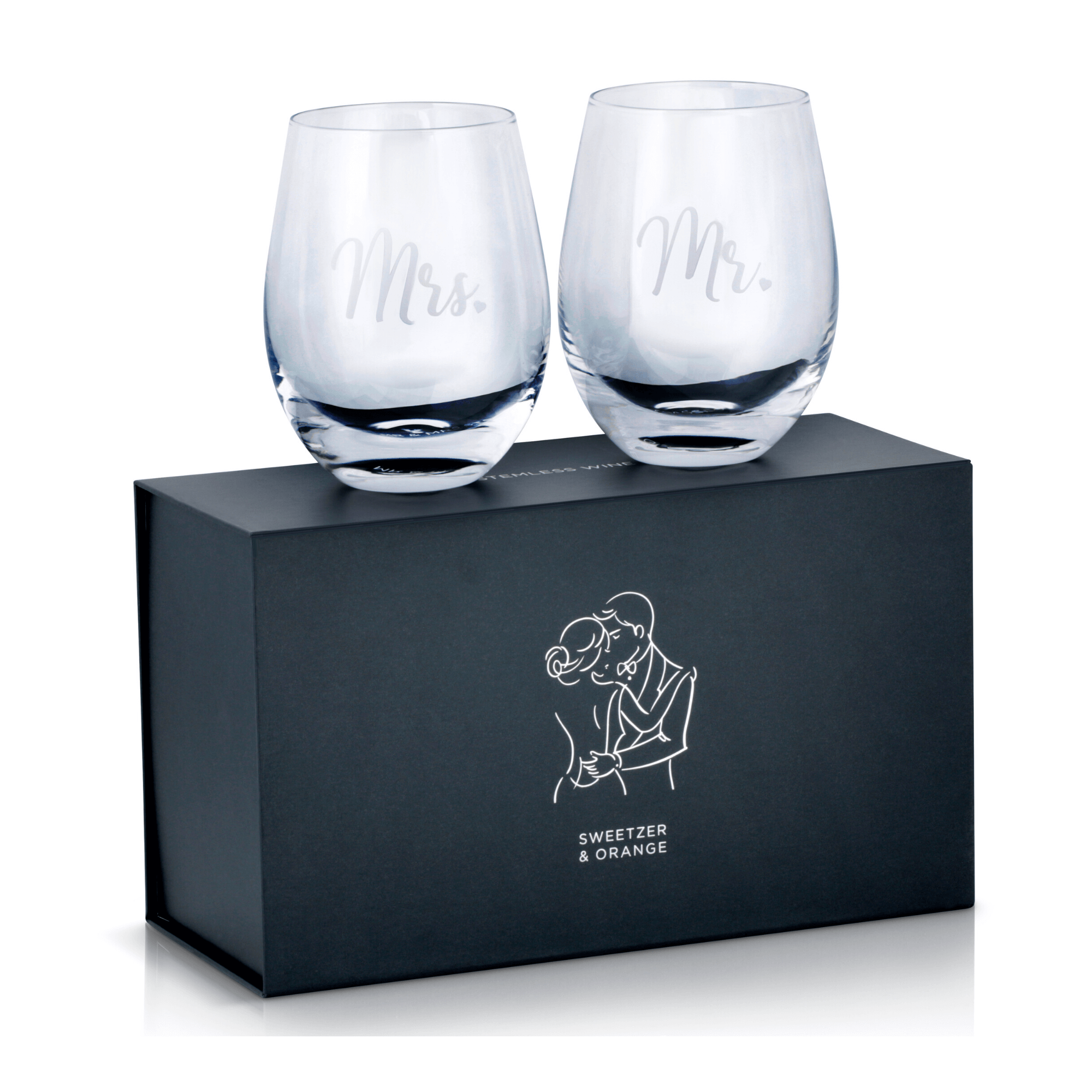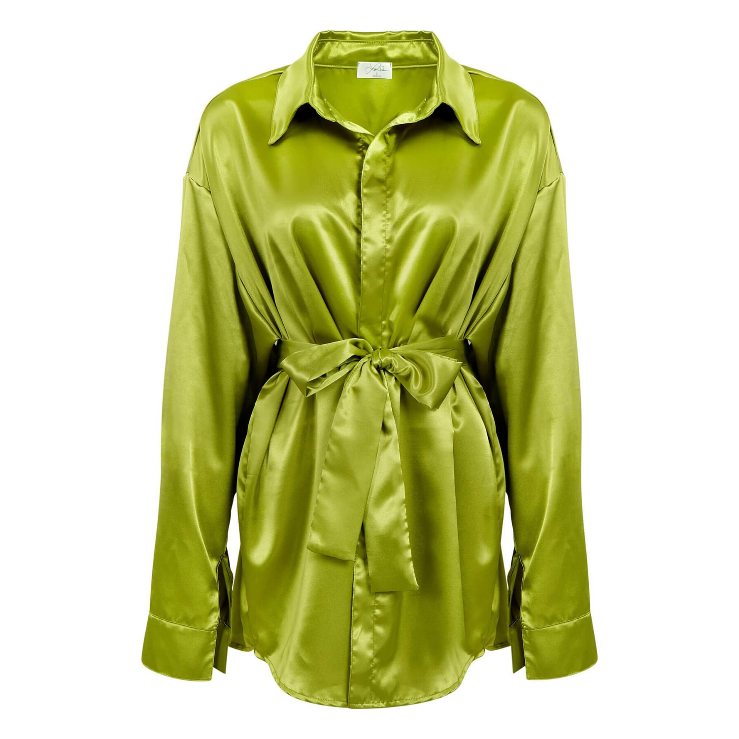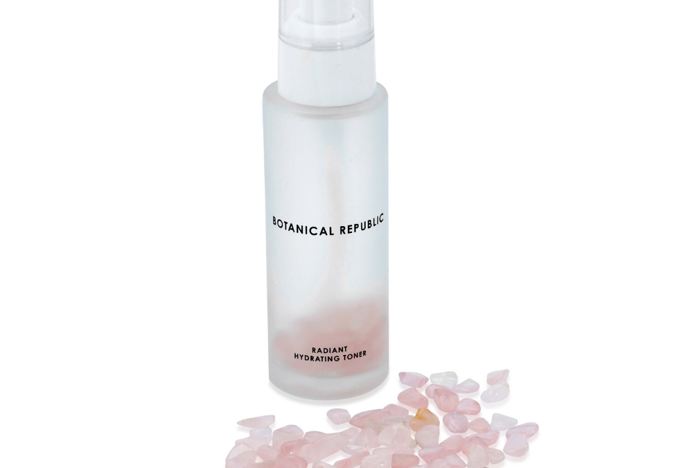
A shopper searching Amazon can compare your product with five similar listings in less than a minute. They may never read the full description. They will, however, notice a dark main image, a confusing product angle, a missing size reference, or color that looks different from the item they expect to receive. That is where Amazon image conversion is won or lost.
For sellers, product photography is not a finishing touch after the listing is built. It is the sales material buyers see first, zoom in on, and use to decide whether your product feels credible enough to purchase. Better images can increase clicks from search results, answer objections before they become returns, and give shoppers a clear reason to choose your brand over a lower-priced alternative.
What Amazon Image Conversion Really Means
Amazon image conversion is the ability of your listing images to move a shopper from interest to purchase. It is not simply about making a product look attractive. A conversion-focused image set makes the product easy to understand, easy to compare, and easy to trust.
The main image earns the click. The remaining images do the selling. Together, they should show exactly what the buyer receives, how the product works, where its value comes from, and which details separate it from competing options.
This is especially important in categories with limited tactile experience. A shopper cannot feel the fabric of a shirt, inspect a jewelry clasp, judge the scale of a countertop appliance, or see the finish on a beauty package in person. Your images have to close that information gap without creating uncertainty.
Start With a Main Image That Stops the Scroll
The main image is usually your first and most valuable opportunity. On Amazon, it must meet marketplace requirements while still making the product look clean, substantial, and professionally presented. In most categories, that means a product shown clearly against a pure white background, with no distracting props, badges, text, or lifestyle scene.
A compliant white-background image does not have to look flat. Proper lighting creates separation between the product and the background, preserves texture, and prevents white, clear, reflective, or glossy products from disappearing into the page. Professional retouching removes dust, fingerprints, uneven reflections, and small packaging flaws that can make an otherwise good product look low quality.
Framing matters as much as lighting. The product should occupy enough of the image area to be immediately recognizable on mobile, where many Amazon purchases begin. At the same time, it needs breathing room so edges are not cropped and the listing looks polished in search results.
For apparel, the main image must show accurate fit and color without wrinkled fabric or inconsistent styling. For jewelry and watches, buyers need clean highlights and sharp detail without reflections that hide the piece. For glassware, cosmetics, and beverages, careful lighting is essential because transparent surfaces and glossy labels expose every production mistake.
Build an Image Sequence That Answers Buying Questions
Once a buyer clicks, the image gallery should reduce hesitation in a logical order. Think of each image as a salesperson answering a specific question. What is it? What comes with it? How large is it? What is it made of? How does it work? Why is it worth the price?
A strong sequence often begins with a second clean product view, followed by close-ups of important materials or features. From there, use images that communicate dimensions, included components, usage, and real-world scale. The right mix depends on the product, but each image should add information rather than repeat the same angle.
For example, an electronics listing may need a ports-and-controls close-up, an image showing what is included in the box, and a scale shot next to a familiar object. A skincare product may need a clear package image, texture or application photography, size information, and a visual explanation of its key benefit. A handbag needs exterior, interior, hardware, strap, and scale views because buyers want to know how it looks and how it functions.
Text overlays and infographics can be highly effective on secondary images when they are concise and accurate. Avoid turning every frame into a crowded brochure. One strong message per image is easier to scan, particularly on a phone. Use readable type, enough contrast, and claims that can be supported by the product and listing content.
Show scale before buyers have to ask
Poor scale communication is a common cause of disappointed customers and avoidable returns. A product can look much larger or smaller online than it does in real life, especially in categories such as jewelry, accessories, storage products, toys, and beauty items.
Dimensions in text are useful, but a visual scale reference is more persuasive. Show the item in a hand, on a model, on a desk, or in the intended setting when appropriate. The goal is not to make the product appear bigger. It is to help customers buy with confidence.
Use lifestyle images carefully
Lifestyle photography gives a product context and can make benefits feel immediate. A candle belongs in a styled living room, activewear belongs on a moving body, and a kitchen tool is easier to understand when shown in use. These images help shoppers picture ownership.
But lifestyle shots cannot replace clear product views. If a buyer cannot see the exact item, finish, color, or included components, the image may create interest without completing the sale. The strongest Amazon galleries balance clean catalog photography with believable use-case photography.
Why Color Accuracy Protects Conversion and Returns
Color is a conversion issue, not just a design preference. When an apparel item arrives in a shade that feels different from the listing, or a cosmetic container looks unlike the product photo, customers lose confidence quickly. Returns, negative reviews, and variation complaints can follow.
Accurate color requires more than a phone camera and a filter. Lighting, camera settings, monitor calibration, background balance, and retouching all affect the final result. The challenge is greater with white products, black products, metallic finishes, gemstones, reflective packaging, and fabrics with subtle undertones.
Retouching should correct distractions, not invent a different product. It is reasonable to remove dust and minor production marks. It is not smart to alter a product’s true color, material texture, or included features just to make the listing look more appealing. Short-term clicks are not worth the long-term cost of mismatched expectations.
Common Image Problems That Lower Amazon Conversion
Many weak listings do not fail because the product is poor. They fail because the image set creates doubt. Low resolution makes details hard to inspect. Inconsistent lighting makes variations look unrelated. Overedited photos can make buyers question whether the product shown is real.
Other issues are less obvious. A large amount of empty space can make a product look small in search results. Busy graphics can hide the actual item. Repeating nearly identical images wastes gallery positions that could explain a benefit, show a size, or demonstrate use.
Watch for these four problems before publishing a listing:
- A main image that is technically compliant but too small, dark, or poorly defined to stand out in search.
- Product angles that hide key features such as closures, ports, texture, labels, or interior compartments.
- Graphics that make oversized claims, use unreadable text, or compete with the product for attention.
- Images from different shoots that vary in background tone, color, shadows, or styling.
Consistency is a brand advantage. When every product page has the same level of lighting, color control, and retouching, the catalog feels established. That impression matters for independent brands competing against familiar names.
A Practical Production Plan for Better Images
Before a shoot, identify the images your listing actually needs. Gather the product, packaging, accessories, measurements, color variations, and any details that customers frequently ask about. Review your top competitors, not to copy them, but to find unanswered questions and visual gaps you can address better.
Then create a shot plan around the buyer’s decision. Include the required main image, alternate angles, feature close-ups, scale references, and selected lifestyle or infographic images. If you sell multiple variations, photograph them consistently so buyers can compare colors, sizes, or configurations without confusion.
For fast-moving catalogs, working with a commercial product studio keeps this process scalable. Product Photography Studio produces high-resolution ecommerce imagery with professional retouching, category-specific handling, and image pricing starting as low as $12 per image. That combination is useful when you need reliable visual quality without building an in-house production team.
Measure Results, Then Improve the Right Images
Photography should be treated as an asset that can be tested and improved. Monitor click-through rate, conversion rate, return reasons, customer questions, and review feedback after updating a listing. If shoppers click but do not buy, the main image may be doing its job while secondary images fail to answer key questions. If returns mention size, color, or missing components, your gallery may need clearer expectation-setting.
Not every listing needs the same visual formula. A simple replacement part may convert with clean angles, measurements, and compatibility information. A premium watch, beauty product, or fashion item may need more detail photography and a stronger lifestyle story. The right image plan depends on the product, price point, competitive category, and what buyers need to feel comfortable purchasing.
Before you spend more on ads to push a weak listing, look closely at what shoppers see after they click. Clear, accurate, professionally produced images give your product the chance to earn the sale it already deserves.