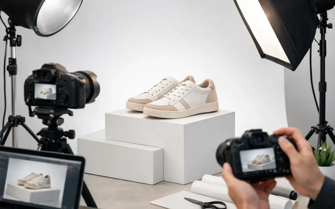
A product image that looks great on a product page can still fail the moment it goes to print. Soft edges, muddy shadows, color shifts, and low-resolution files become obvious fast in catalogs, magazines, packaging, and retail signage. That is why print ready product photography is not just about taking a clean photo. It is about creating an image that holds up under real production standards.
For brands selling across ecommerce and print, that difference matters. Your website, sales sheets, line cards, lookbooks, trade show graphics, and packaging all need images that stay consistent from screen to press. If the photography is not built for both quality and output requirements, you end up paying twice – once for the shoot and again for fixes, reshoots, or compromised print results.
What print ready product photography actually means
Print ready product photography is commercial product imagery prepared to reproduce clearly and accurately in physical materials. That includes the photo itself, the retouching, the resolution, the color handling, the clipping or background work, and the final file delivery. A strong image for print is not simply a larger version of a web image. It is captured and finished with print reproduction in mind from the start.
In practical terms, that means the file needs enough resolution for the intended size, clean detail at 100 percent view, controlled highlights and shadows, and color that stays believable when printed. It also means understanding where the image will be used. A jewelry close-up in a luxury catalog has different requirements than a beverage image on a corrugated box or a skincare product in a magazine ad.
This is where many brands run into trouble. They assume a high-resolution JPEG is enough. Sometimes it is. Sometimes it is not. If the original lighting was flat, reflective surfaces were not controlled, or retouching removed natural texture, the larger file does not solve the real problem.
Why web-ready and print ready are not the same
Digital platforms are forgiving. Most ecommerce images are viewed quickly, often on mobile, and compressed by the platform itself. Print is less forgiving because the image becomes a physical object. Viewers can hold it inches from their face. Fine dust, rough masking, poor edge cleanup, color contamination, and inconsistent shadows all show up more clearly.
Resolution is one obvious difference, but it is not the only one. Print production also depends on color accuracy, tonal range, and file preparation. A product that looks bright and clean on a backlit screen may print darker or less saturated if the original capture was not carefully managed. White packaging can turn gray. Cosmetic tones can shift. Metal can lose depth. Apparel can print with the wrong color cast, which is especially risky when customers expect visual consistency across a collection.
That is why experienced commercial studios plan backward from the final use. They ask how large the image will run, what kind of material it is being printed on, whether the background needs to knock out cleanly, and how much retouching can be done without making the product look artificial.
The production details that matter most
Sharpness comes first, but not in the exaggerated way people often mean it. Print needs real optical detail, not oversharpening added later. The fabric weave on apparel, the facets on gemstones, the label texture on a premium bottle, or the brushed finish on electronics should read clearly without halos or crunchy edges.
Lighting is just as critical. Good print photography uses lighting that defines shape and material honestly. Glass, chrome, glossy packaging, and polished jewelry are where experience shows. These surfaces need controlled reflections, not random hotspots. A flat file can sometimes be improved in retouching, but it rarely gains the dimensional quality that proper lighting would have captured in the first place.
Color accuracy is another make-or-break factor. For ecommerce, small shifts may go unnoticed. For print, especially in apparel, beauty, and branded packaging, inaccurate color can create production issues and customer complaints. If a navy garment prints too purple or a skincare bottle loses its brand-specific tone, the image stops serving the business.
Then there is background extraction and edge work. Clean clipping paths and refined masking matter more in print layouts because cutout products often sit against designed backgrounds, text blocks, or promotional graphics. Ragged edges around hair, frayed fabric, transparent materials, or reflective contours will not look professional once placed into a catalog spread or ad layout.
Different products need different print strategies
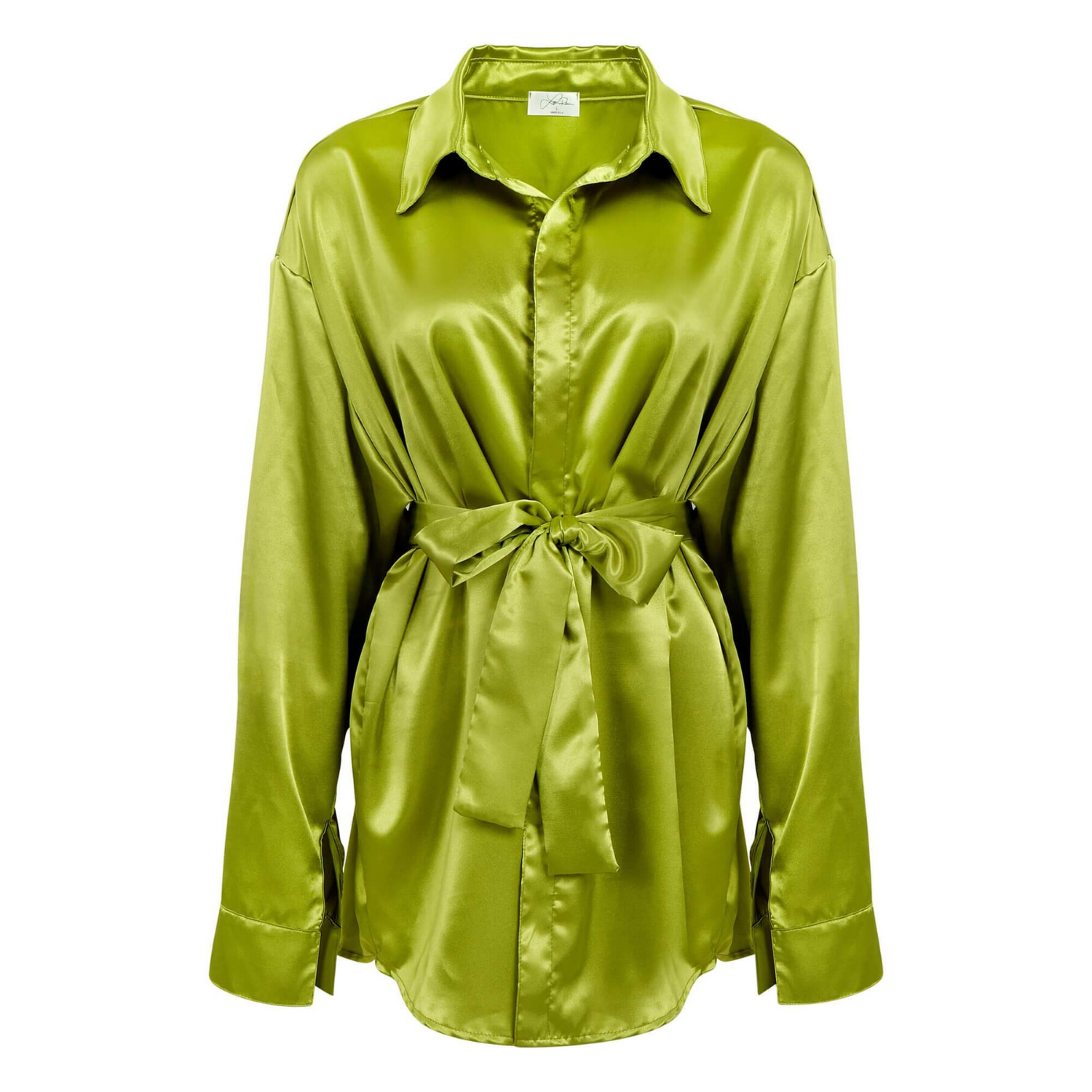
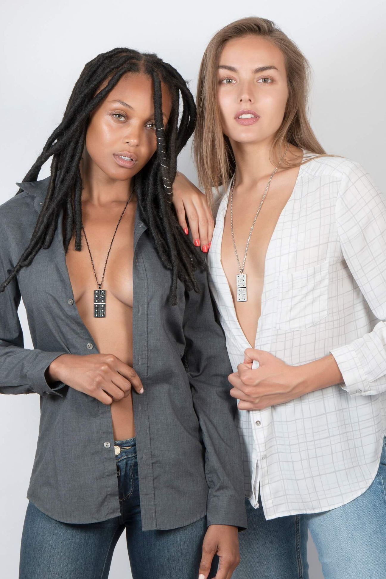
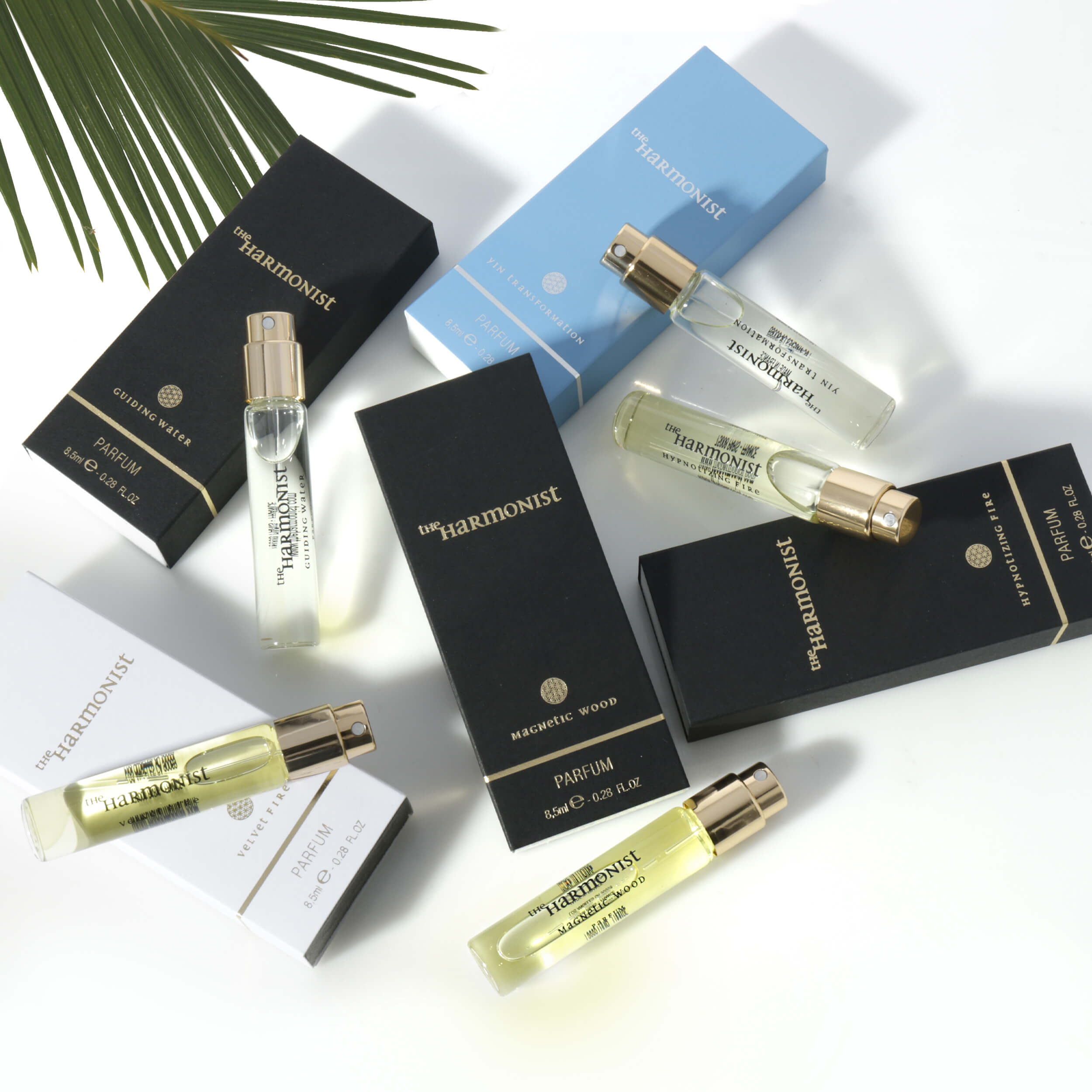
There is no single setup that works for every category. Jewelry needs precision, controlled sparkle, and retouching that enhances without making stones or metals look fake. Apparel needs accurate color, natural shaping, and enough texture detail to support both merchandising and brand presentation. Beauty products require clean surfaces, label clarity, and polished finishing that still feels believable.
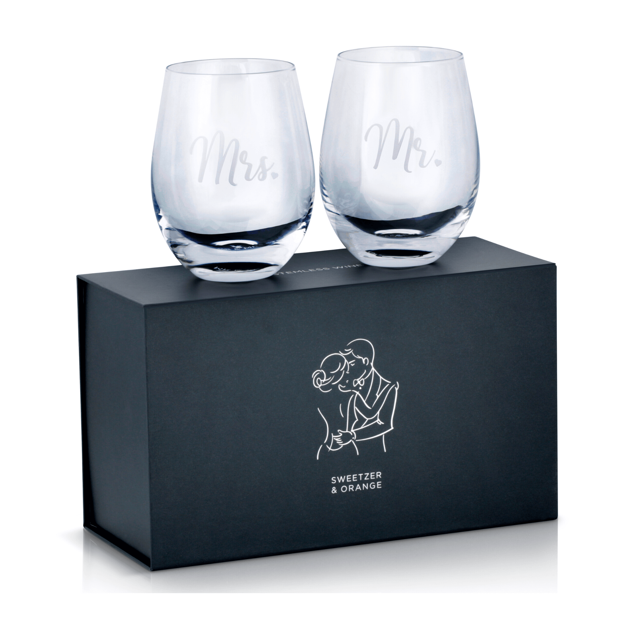
Glassware and beverages bring another layer of complexity because transparency and liquid color can shift easily under print conditions. Electronics need shape definition and edge control so dark finishes do not collapse into flat blocks. Household goods, medical products, and office supplies may seem straightforward, but they still need consistent lighting and proportion if they are being used across a large printed assortment.
This is one reason brands benefit from working with a studio that handles multiple product categories. The technical choices behind print ready product photography change based on material, scale, finish, and intended use. A one-size-fits-all workflow usually shows its limits fast.
File prep is part of the service, not an afterthought
A strong shoot can still get delayed if the delivery is not production-friendly. Print teams often need specific dimensions, file formats, background treatments, or layered files that work inside a broader design process. If the images arrive inconsistently cropped, poorly named, or missing the right output settings, the job slows down.
Good commercial delivery is organized and predictable. That includes high-resolution files sized for print use, retouched masters that preserve quality, and output versions prepared for the client’s actual application. Sometimes that means clean white background files. Sometimes it means transparent-background cutouts or images built to sit inside a packaging layout.
There is also a trade-off here. Over-processing an image to make it look dramatic can reduce flexibility later. Heavy contrast, clipped highlights, or aggressive skin-smoothing on beauty packaging may look striking in one mockup but reproduce poorly across multiple print applications. A commercially smart file leaves room for design and production teams to use it confidently.
Speed matters, but control matters more
Most brands do not have endless timelines. New launches, seasonal catalogs, retailer deadlines, and Amazon updates all move fast. Quick turnaround is valuable, but speed only helps if the files are right the first time. Rushed photography often creates hidden costs through revision cycles, missed approvals, and output issues that show up only after design placement.
That is why an efficient studio workflow matters. When capture, retouching, and delivery are handled with clear standards, brands get print-capable images without the drag of repeated corrections. Product Photography Studio works with this kind of commercial reality every day – clients need polished files, fair pricing, and dependable turnaround because image delays affect sales and launch schedules.
How to know if your images are truly print ready
The simplest test is to look beyond the screen. Ask where the image will appear, how large it will print, and whether fine product detail still looks clean at that size. Check the edges, the color, the realism of highlights, and the integrity of texture. If it only looks good when reduced on a website, it is probably not ready for serious print use.
It also helps to ask whether the image can serve more than one channel. The best commercial product photography gives brands flexibility. A well-executed hero image can support a catalog, a line sheet, a magazine placement, a retail sell sheet, and an ecommerce listing with only minor output adjustments. That kind of scalability lowers production costs and keeps the brand presentation consistent.
Print quality is not about making images look expensive for the sake of it. It is about making sure your products reproduce cleanly, professionally, and credibly wherever customers see them. When the photography is built for print from the start, your marketing materials work harder, your brand looks more established, and your team spends less time fixing avoidable problems later.
If your products are headed for catalogs, packaging, sales collateral, or retail graphics, it pays to treat photography as part of production, not just promotion.