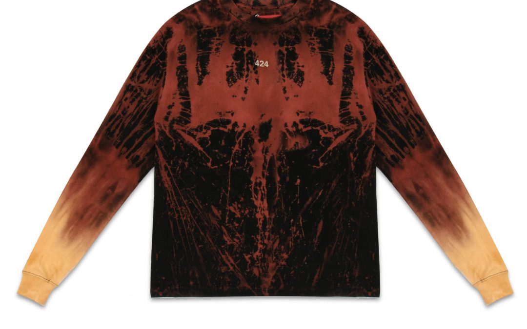
A customer who orders navy and receives something that looks purple is unlikely to blame the camera. They will blame the brand. Knowing how to get color accurate apparel photos protects customer expectations before an item reaches the cart, reduces avoidable returns, and gives your product pages a more credible, consistent look.
For apparel sellers, color accuracy is not simply a retouching preference. It is a production standard. Fabric responds to light differently than hard products, and the same shirt can appear warmer, cooler, darker, or more saturated depending on the lighting setup, background, monitor, and editing workflow. Getting it right requires control from the first test frame through final delivery.
Start With the Actual Garment Color
The product itself must be the reference point. Before photography begins, inspect the garment under neutral, consistent light and compare it with any approved brand color standard, fabric swatch, or physical sample. Product names can be useful, but labels such as “dusty rose,” “stone,” or “ocean blue” are not technical color specifications.
When a brand has Pantone references or approved samples, provide them to the photography team. This gives retouchers a reliable target when the image on screen needs a final check. A color reference is especially valuable for seasonal collections, matching sets, uniforms, and products available in several closely related shades.
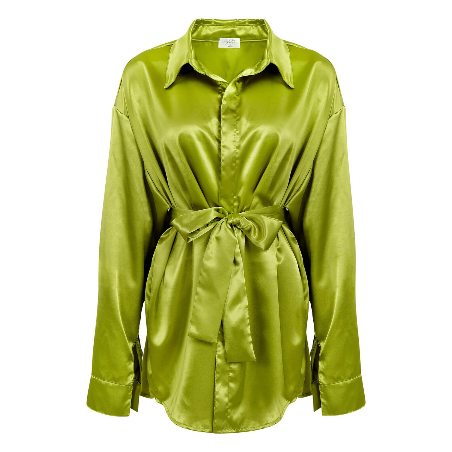
Keep in mind that fabric color is rarely flat. A knit sweater may show darker valleys and lighter raised fibers. Satin reflects highlights. Velvet shifts color with the direction of the pile. Denim has intentional variation. The goal is not to remove every natural tonal change. The goal is to make the photographed garment look like the garment a buyer will receive.
Use Consistent, Color-Controlled Lighting
Mixed lighting is one of the fastest ways to create inaccurate apparel images. Window light can change minute by minute. Office lights may be warm, while studio strobes are cooler. When those sources hit the same garment, white balance becomes difficult to correct without affecting the actual fabric color.
A controlled studio setup is the better choice for ecommerce apparel. Use lights with consistent color output, then keep the same lighting arrangement for every product in the collection. This matters when customers compare colors side by side on a collection page or marketplace listing.
Soft, even lighting often works best for flat lays, ghost mannequin photography, and basic catalog images because it reveals the garment without creating distracting shadows. However, evenly lit does not mean flat-looking. Direction, diffusion, and fill should still preserve stitching, texture, seams, drape, and shape. A black hoodie needs enough detail to show construction, while a white blouse needs highlight control so details do not disappear.
Avoid relying on automatic white balance. Camera auto settings can make subtle adjustments from one frame to the next, creating visible inconsistency across a product line. Set a custom white balance based on the lighting in use, and recheck it any time the setup changes.
Photograph a Color Reference Frame
A gray card or professional color target photographed under the same lights as the garment creates an objective reference for editing. Capture it at the beginning of the shoot and again whenever lighting, camera settings, or product position changes.
This small step helps a retoucher correct white balance and establish a consistent baseline. It is particularly useful for light neutrals, cream tones, pale pastels, charcoal, and dark navy – colors that often shift noticeably in product photography.
Choose Backgrounds That Do Not Distort Perception
Pure white is the standard background for many ecommerce sites and Amazon main images, but it should be truly neutral. A background with a warm cast can make a white garment appear yellow. A cool blue-white surface can make beige, gray, and cream clothing look different than it does in person.
For standard product listings, a clean white background creates a familiar visual environment and keeps attention on the item. For lookbooks and brand campaigns, a neutral gray or approved lifestyle setting may make sense. The trade-off is that colored walls, props, and reflective surfaces can introduce color casts, especially on glossy fabrics and light garments.
If your catalog includes multiple photography styles, maintain a dependable product-image standard for the primary selling photos. Styled imagery can support brand storytelling, but the clearest color representation should appear early in the product gallery.
Capture Enough Detail to Support the Color Claim
One front-facing image is not always enough to communicate color accurately. Customers assess color through highlights, shadow areas, fabric texture, and close-up detail. A well-planned apparel photo set should show the full garment while also giving shoppers a closer view of the material.
For products with special finishes, add detail shots that show what buyers need to understand. This may include heathered yarn, ribbing, washed denim, metallic thread, sequins, embroidery, suede, or sheer overlays. A close-up does more than improve presentation. It explains why the color may naturally vary across the fabric.
For garments available in several colors, photograph each colorway rather than digitally recoloring a single image whenever possible. Digital color changes can be useful for limited applications, but they often miss the way each fabric dye responds to texture, stitching, sheen, and shadow. Real photography is the safer option when color is a key purchase decision.
Edit for Accuracy, Not Artificial Perfection
Retouching is where a strong apparel image becomes ready for sale, but excessive editing can create the same customer disappointment as poor lighting. The editor should correct exposure, white balance, background consistency, minor wrinkles, lint, and distracting imperfections without changing the garment into a different product.
Pay close attention to selective adjustments. Increasing saturation globally may improve one color while making another look unrealistic. Pulling down shadows too far can turn navy into black. Brightening a cream garment can push it toward white. Color correction should be evaluated garment by garment, not applied as a one-click preset across the entire collection.
A professional workflow also keeps the background separate from the product. This allows the white background to meet marketplace requirements without washing out white, ivory, or pastel apparel. Clean clipping paths and precise edge work are essential around fine straps, lace, fringe, mesh, and textured edges.
Calibrate the Screens Used for Approval
A color-corrected image can still look wrong on an uncalibrated screen. If the monitor used for approval is too warm, too cool, too bright, or overly saturated, your team may request edits that move the image away from the actual product.
Calibrate production monitors on a regular schedule and use the same approved display for final color review. This is especially useful for brands with an in-house creative director, ecommerce manager, or merchandising team responsible for approving large volumes of product photography.
You cannot control every shopper’s phone, laptop, or tablet. Different devices and display settings will always create some variation. What you can control is whether your original, approved image is accurate on a calibrated workflow and consistent across your own website, marketplace listings, ads, and print materials.
Build a Repeatable Apparel Photography Process
The best way to maintain color across hundreds of SKUs is to document the process. Record the light setup, camera settings, lens choice, background treatment, white-balance method, file naming, and retouching standards. A repeatable workflow reduces variation when new products arrive or when photography happens across multiple production days.
Before a full shoot, approve a small test set that includes challenging colors: white, black, cream, red, navy, and a light pastel. These samples reveal problems that may not be obvious on a medium-tone garment. Correct the setup early rather than retouching hundreds of files later.
For fast-moving ecommerce teams, outsourcing to an experienced commercial studio can make this process more reliable. Product Photography Studio works with controlled lighting, professional retouching, and high-resolution delivery to help apparel brands create consistent images built for product pages, marketplaces, catalogs, and campaigns.
Check Images Where Customers Will See Them
Final approval should not happen only in an editing application. Review selected files at the size and background color used on your ecommerce platform or marketplace. A garment that looks accurate as a large file can appear too dark, too small, or too low-contrast as a mobile product thumbnail.
Also compare related products together. Place all black tees, beige pants, or blue dresses side by side and look for shifts that could confuse shoppers. Consistency within a category often matters as much as the accuracy of any single image.
Accurate apparel photography gives buyers fewer reasons to hesitate. When the product on screen looks like the product in the package, your imagery does more than meet a visual standard – it supports trust at the moment a customer decides to buy.