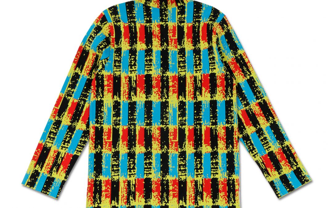
A navy dress that appears royal blue, a cream sweater that reads yellow, or a black jacket with lost texture can cost an apparel brand more than a sale. It can create hesitation before checkout, disappointing unboxing experiences, and avoidable returns. Color accurate clothing photography gives online shoppers a more reliable view of what they are buying, helping your listings look polished while setting the right expectation.
For ecommerce apparel, color is not a minor production detail. It is a selling feature. Shoppers often choose between the same style in several shades, and they need to trust that the color on screen is close to the garment that arrives at their door.
Why Color Accuracy Matters for Apparel Sales
A strong clothing image does more than make a product look attractive. It answers practical questions quickly: Is this burgundy closer to wine or red? Does the white fabric look bright or ivory? Can the customer see the texture of black denim, charcoal knitwear, or deep green velvet?
When color shifts from image to image, a collection can look inconsistent even when every garment is well made. That inconsistency weakens the perceived quality of the brand. It also makes it harder for buyers to compare styles, colors, and seasonal releases across your website, marketplace listings, catalog, and social campaigns.
Accurate color helps reduce the gap between online browsing and the real product. It cannot control every buyer’s screen setting or room lighting, but it gives customers the most dependable starting point possible. For brands selling high-volume basics, premium fashion, uniforms, activewear, or limited-run collections, that reliability supports better purchasing decisions.
Color Accurate Clothing Photography Starts Before the Camera
Post-production can refine an image, but it should not be used to rescue poor capture conditions. The most reliable results begin with a controlled studio setup where lighting, exposure, garment preparation, and camera settings are consistent from one item to the next.
The garment must be prepared carefully before photography begins. Wrinkles, lint, uneven stuffing on a mannequin, and distorted seams create shadows and highlights that can make fabric appear darker or lighter than it actually is. Steaming, shaping, pinning, and styling are part of color presentation because they determine how light moves across the material.
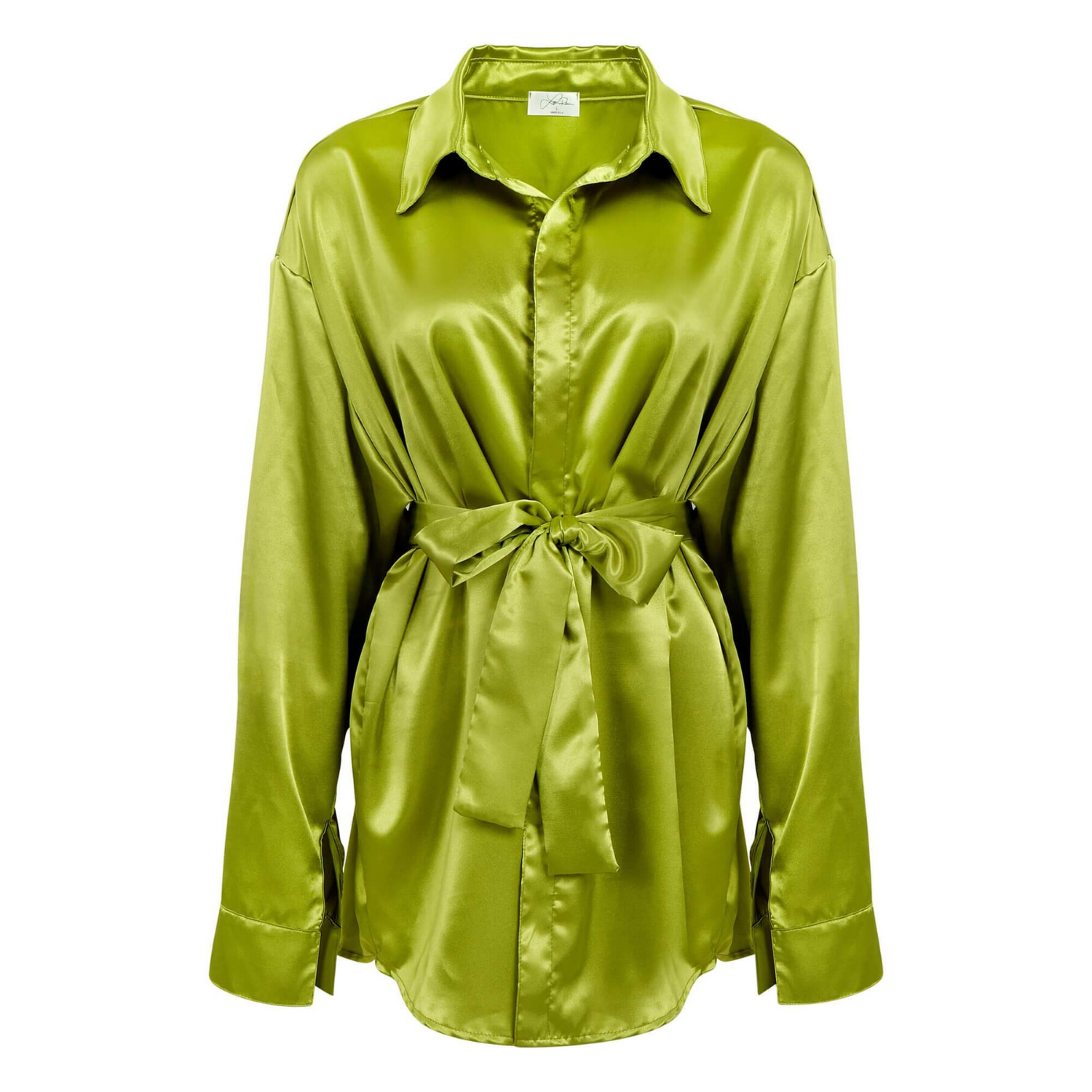
Lighting should be broad, soft, and repeatable. A lighting setup that looks flattering for a pale satin blouse may not work for a black leather skirt or a highly reflective sequined top. Bright fabrics can lose detail when overexposed, while dark garments can turn into flat silhouettes when there is not enough separation between the clothing and the background.
The goal is not to make every item equally bright. The goal is to retain true color, visible texture, and accurate tonal detail. A black garment should look black, but customers should still be able to see its construction, drape, stitching, and material.
White Balance Is Not a Guess
Mixed lighting is one of the fastest ways to introduce unwanted color casts. Daylight from a nearby window, overhead room lights, and studio strobes can each have a different color temperature. A garment that looks neutral in person may photograph too warm, too cool, greenish, or magenta.
A professional apparel workflow uses consistent light sources and custom white balance practices rather than relying on automatic camera settings. Reference targets can help establish a neutral baseline at the start of a shoot. This is especially useful when a brand needs to photograph multiple garments over several days and expects all images to match.
Automatic white balance is convenient, but it can make subtle adjustments from frame to frame. That is a problem when you are photographing a color assortment. A blush pink top, for example, may appear slightly different in every angle if the camera is making independent color decisions.
The Background Affects Perceived Color
Most ecommerce clothing photography uses a clean white, light gray, or transparent-ready background because it keeps attention on the product and meets marketplace requirements. But background brightness still needs to be controlled.
If the background is too bright, pale garments may lose their edges. If it is too dark or carries a color cast, it can affect how shoppers perceive the garment itself. A neutral, consistent background gives the product color a stable visual context and makes catalog pages feel more organized.
For editorial or lookbook imagery, brands may choose colored sets, lifestyle environments, or dramatic lighting. Those images can be effective for campaign storytelling, but they should not replace clean product images for the primary ecommerce listing. A shopper still needs a straightforward, color-reliable view before buying.
A Reliable Color Workflow for Clothing Images
Professional color management connects the studio capture process to the final files used by your sales channels. It includes calibrated equipment, controlled editing, and export settings that preserve the intended look as closely as possible.
A practical workflow typically includes:
- calibrated monitors for dependable editing decisions
- consistent studio lighting and camera exposure across the collection
- reference tools to establish neutral whites and accurate color values
- careful retouching that preserves fabric texture and garment details
- export files optimized for web, marketplaces, print, or catalogs
Monitor calibration matters because an editor cannot correct what they cannot see accurately. A display that is too blue, too warm, or overly bright can lead to unnecessary adjustments. The final image may look acceptable on that one screen but inaccurate everywhere else.
Retouching also requires restraint. Apparel images need cleanup, but aggressive color editing can make cotton look synthetic, flatten natural variations in denim, or remove the depth that makes velvet, silk, leather, and knitwear feel premium. The best retouching improves presentation without changing the product.
Fabrics That Need Extra Attention
Some materials are more difficult to photograph accurately than others. Reflective fabrics can pick up the color of nearby surfaces. Sheer garments can shift depending on what is behind them. Dark materials absorb light, while bright reds and neon shades can exceed what a camera or screen reproduces easily.
Satin, sequins, metallic threads, patent leather, coated fabrics, and embellished garments require deliberate light placement to control glare without making the item look dull. Fine knits, lace, ribbing, and textured fleece need enough directional detail to show their surface without creating harsh shadows.
Denim is another common challenge. Blue jeans can range from crisp indigo to faded vintage washes, and small color differences matter to shoppers. The same is true for white apparel. A pure white tee, soft ivory blouse, and warm cream cardigan should remain clearly distinct in the final product images.
For these products, it often helps to photograph key details separately. A close-up of fabric texture, hardware, embroidery, or wash treatment can support the main product view and give buyers more confidence. Detail images should match the color treatment of the primary image, not become a different visual interpretation of the garment.
Consistency Across a Collection Builds Trust
Color accuracy is most effective when it is consistent across an entire product line. If one product is photographed on a cool white background and the next on a warm white background, customers may assume the garments differ more than they do. The issue becomes more visible on category pages where multiple products appear side by side.
Brands should establish image standards before sending inventory to a studio. Decide whether products will be photographed flat lay, ghost mannequin, on-model, or a combination of formats. Set requirements for backgrounds, crop ratios, angles, detail shots, and file naming. These decisions make it easier to maintain a uniform visual system as new inventory arrives.
The right approach depends on where the images will be used. Amazon listings and many marketplaces need clean, compliant main images. A direct-to-consumer site may benefit from additional lifestyle imagery and close-ups. Print catalogs require special attention to resolution, color profiles, and proofing because paper stock can alter perceived color.
At Product Photography Studio, apparel photography is planned around those commercial needs: clean presentation, detail-focused retouching, high-resolution delivery, and images that work across ecommerce and print production. A consistent production process is particularly valuable for brands that need to launch new styles quickly without compromising visual standards.
Give Customers the Clearest View of What They Are Buying
No product image can appear identical on every phone, monitor, and tablet. Customers use different display settings, and screens render color differently. That is why the studio standard matters so much. You want the source image to be accurate, consistent, and professionally prepared before it reaches the customer.
When clothing looks true to color, visible in texture, and consistent across every SKU, your product pages do more of the selling work. The result is a catalog that feels credible before the shopper ever touches the fabric.