A shopper cannot touch your product, test its weight, or inspect its finish through a screen. Your images have to do that work. The best product photography tips are not about making a listing look artistic for its own sake. They are about removing buyer hesitation, showing real value, and giving customers a clear reason to click Add to Cart.
For ecommerce brands, Amazon sellers, and retail teams, product photography is part of the sales process. A clean hero image earns attention. Accurate color reduces returns. Close-up details justify price. Consistent images make a growing catalog look established and trustworthy.
Best Product Photography Tips for Ecommerce Listings
1. Start with the marketplace requirements
Build the shot before you build the set. Amazon, Shopify, retailer portals, catalogs, and social ads all have different image requirements, crop ratios, background rules, and file specifications. A photo that looks strong in a square marketplace thumbnail may not work as a full-width website banner or a printed lookbook image.
For most ecommerce listings, plan for a white-background primary image, several detail views, at least one scale or use image when appropriate, and any required packaging or label shots. Keep enough space around the product to allow for platform cropping. Cutting too close to an item can make it feel cramped and can hide important features on mobile.
The goal is not to produce one attractive image. It is to create a complete image set that answers the questions a buyer will ask before purchasing.
2. Use lighting that describes the product accurately
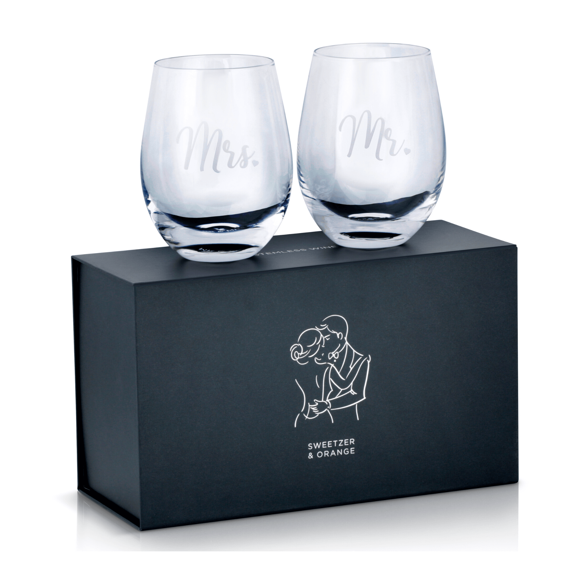
Lighting should reveal shape, material, texture, and color without creating distractions. Flat lighting can make a premium product look inexpensive. Harsh, uncontrolled light can create glare on glass, metal, jewelry, glossy packaging, screens, and beauty containers.
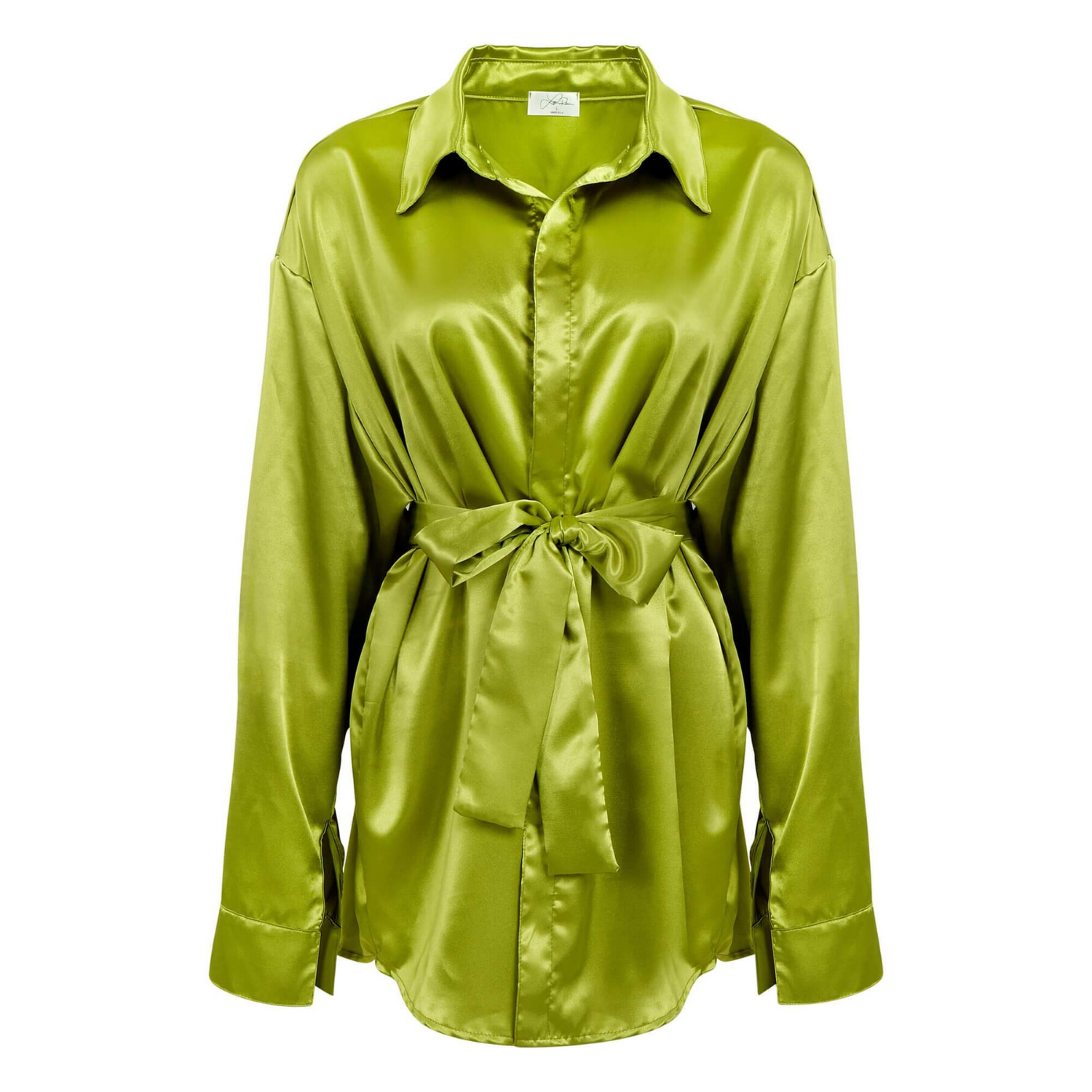
Soft, shaped light is often the right starting point for commercial product photography because it creates controlled highlights and readable shadows. But the setup depends on the product. A watch needs reflective surfaces carefully managed so the case and dial remain visible. A beverage bottle may need crisp edge highlights to separate it from the background. Apparel needs even lighting that preserves the true color and fabric texture.
Do not assume brighter is better. Overexposure erases white labels, light-colored fabrics, and subtle material details. The right exposure keeps highlights clean while retaining information in the brightest areas.
3. Make color accuracy a non-negotiable standard
Color is a conversion issue and a return-rate issue. If a customer receives a navy garment that looked black online, or a warm ivory product that appeared bright white, trust is lost quickly.
Use a consistent lighting setup and calibrated workflow from capture through retouching. Shoot with a color reference when color matters, especially for apparel, cosmetics, gemstones, packaging, and products sold in multiple shades. Editing should correct color casts and uneven exposure, not alter the product into something it is not.
There is a trade-off here. Aggressive editing can make a product pop on screen, but it can also make the listing misleading. The best commercial images look polished while staying faithful to what arrives in the customer’s hands.
4. Choose angles that answer buying questions
Every angle should earn its place. A front view may establish the product, but it rarely tells the full story. Buyers may need to see the side profile, back, closure, ports, underside, interior, texture, scale, or product in use.
Think through the objections before the shoot. Is the customer likely to ask whether a bag has interior pockets? Show them. Will they want to know how thick a notebook is, how a bracelet fastens, or what connections an electronic device includes? Photograph those features directly.
For products with a defining detail, make it easy to find. Jewelry needs close-ups of stones, settings, clasps, and metal finish. Beauty products need readable labels and clear texture imagery. Furniture and household goods benefit from feature views that show construction, dimensions, or mechanisms.
5. Keep the primary image simple and compliant
The hero image has one job: make the product immediately recognizable in search results. A clean white background is often essential for marketplace compliance and remains one of the most effective ways to show a product without visual clutter.
Avoid props, decorative text, distracting shadows, or overly tight crops in the primary listing image when platform rules call for a plain product presentation. Save lifestyle scenes, comparison graphics, ingredient callouts, and promotional messaging for secondary images where permitted.
Simplicity does not mean carelessness. The item should be centered appropriately, sharply rendered, properly cleaned, and visually balanced. A wrinkled label, dusty surface, crooked cap, or inconsistent crop can make even a good product look less credible.
Build a Consistent Visual System
6. Create standards before photographing a full catalog
Consistency matters more as your product line grows. If one image has a bright white background, another is gray, and a third has a different camera angle, the catalog can look pieced together. Customers may not consciously identify the problem, but they notice the lack of polish.
Set standards for camera angle, product scale within the frame, shadow style, background, color treatment, file naming, and output size. For apparel, establish whether each item will be photographed flat, on a mannequin, ghost mannequin, or on-model. For beauty and packaged goods, determine label orientation and how much of the container fills the frame.
These decisions speed up future shoots and give your marketing team usable assets across product pages, ads, email campaigns, wholesale sheets, and print materials.
7. Show scale without creating confusion
Scale is one of the most common gaps in ecommerce photography. A small item can look large when photographed in isolation, while a large item can look smaller than expected. Dimensions in the description help, but an image can communicate scale faster.
Use a model, a hand, a room setting, or a familiar object when it helps the shopper understand size. The reference should support the product, not compete with it. For example, a model can show handbag proportion effectively, while a close-up hand shot can clarify the size of a ring or cosmetic applicator.
If you use graphics for measurements, keep them accurate, readable on mobile, and separate from the main product photo when marketplace guidelines require it.
8. Retouch for polish, not fiction
Professional retouching is where a good capture becomes a sales-ready asset. It can remove dust, fingerprints, minor manufacturing marks, background inconsistencies, unwanted reflections, loose threads, and distractions that pull attention from the product.
Retouching should also preserve the product’s identity. Do not remove a functional seam, alter the stone color, erase legitimate texture, or reshape a product beyond recognition. Customers should receive what they were shown.
This is particularly important for jewelry, glassware, chrome, cosmetics, and apparel. These categories are difficult because every flaw, reflection, and color shift is visible. Detail-focused post-production helps the product look its best without crossing into an inaccurate representation.
9. Capture enough resolution for every intended use
Low-resolution images can limit your options fast. A small file might work for a marketplace thumbnail but fail when your team needs a catalog spread, print ad, large website crop, or retailer submission.
Capture and retain high-resolution master files, then export versions sized for the channel where they will appear. Web files should load efficiently, while print files need enough detail for their final dimensions. Image sharpness should be assessed at the size customers will actually see, especially on mobile.
High resolution alone is not a quality guarantee. Focus, lighting, styling, and retouching still determine whether the image looks professional. But starting with a strong master file protects your investment as your marketing needs expand.
10. Use lifestyle images strategically
Lifestyle photography can show context, aspiration, and product benefits that a white-background image cannot. A skincare product on a bathroom counter can establish routine. A beverage served in a real setting can communicate occasion. Apparel on a model helps shoppers understand fit and movement.
It depends on the product and sales channel. A lifestyle shot is usually a supporting asset, not a replacement for clear catalog photography. If the setting is too busy or the product is too small in frame, buyers may still struggle to understand what is being sold.
Choose environments that reinforce the brand and customer use case. Keep props intentional, surfaces clean, and styling believable. The product should remain the focal point, even when the image is designed to create a mood.
When Professional Product Photography Is the Better Investment
A DIY setup can be useful for quick internal content, early product testing, or simple social updates. However, it becomes costly when inconsistent lighting, inaccurate color, difficult reflective materials, and time-consuming editing hold back an entire catalog.
Professional product photography is especially valuable when you need scalable image production, marketplace-ready files, reliable color, detailed retouching, or a consistent visual standard across many SKUs. The right studio workflow also reduces reshoots and gives your team assets that can be used across sales channels with royalty-free usage rights.
At Product Photography Studio, commercial product images are built around the details that move shoppers from interest to purchase: clean lighting, high-resolution capture, careful retouching, and dependable turnaround for brands that need to keep listings moving.
Your product has only a few seconds to earn confidence online. Give buyers images that make the product easy to understand, easy to compare, and easy to choose.