A product image can look fine on a product page and still fall apart on a full magazine spread. That is where magazine product photography becomes a different job entirely. Print exposes every flaw – dust, weak edges, uneven color, soft focus, cheap retouching, and poor lighting choices all become obvious fast.
For brands, marketing teams, and sellers preparing for editorial placements, catalogs, lookbooks, or print ads, the goal is not simply to make a product look attractive. The goal is to create images that hold up under close inspection, reproduce accurately on the page, and present the product in a way that supports both brand perception and sales. That requires planning, technical control, and post-production that is built for print from the start.
What magazine product photography really requires
Magazine product photography sits in a space between advertising and catalog work. It needs the polish of a campaign image, but it also has to respect practical publishing standards. That means the creative side and the production side have to work together.
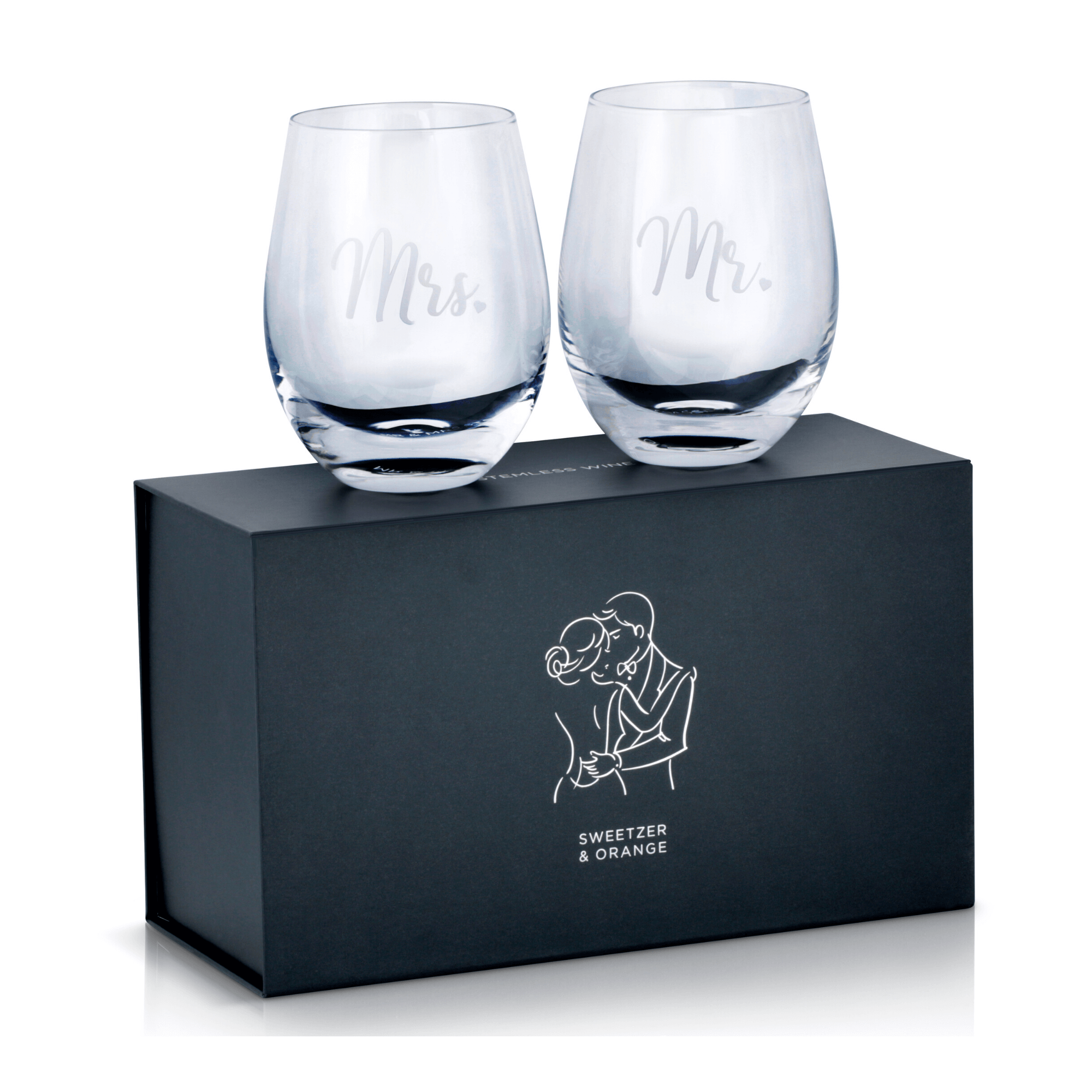
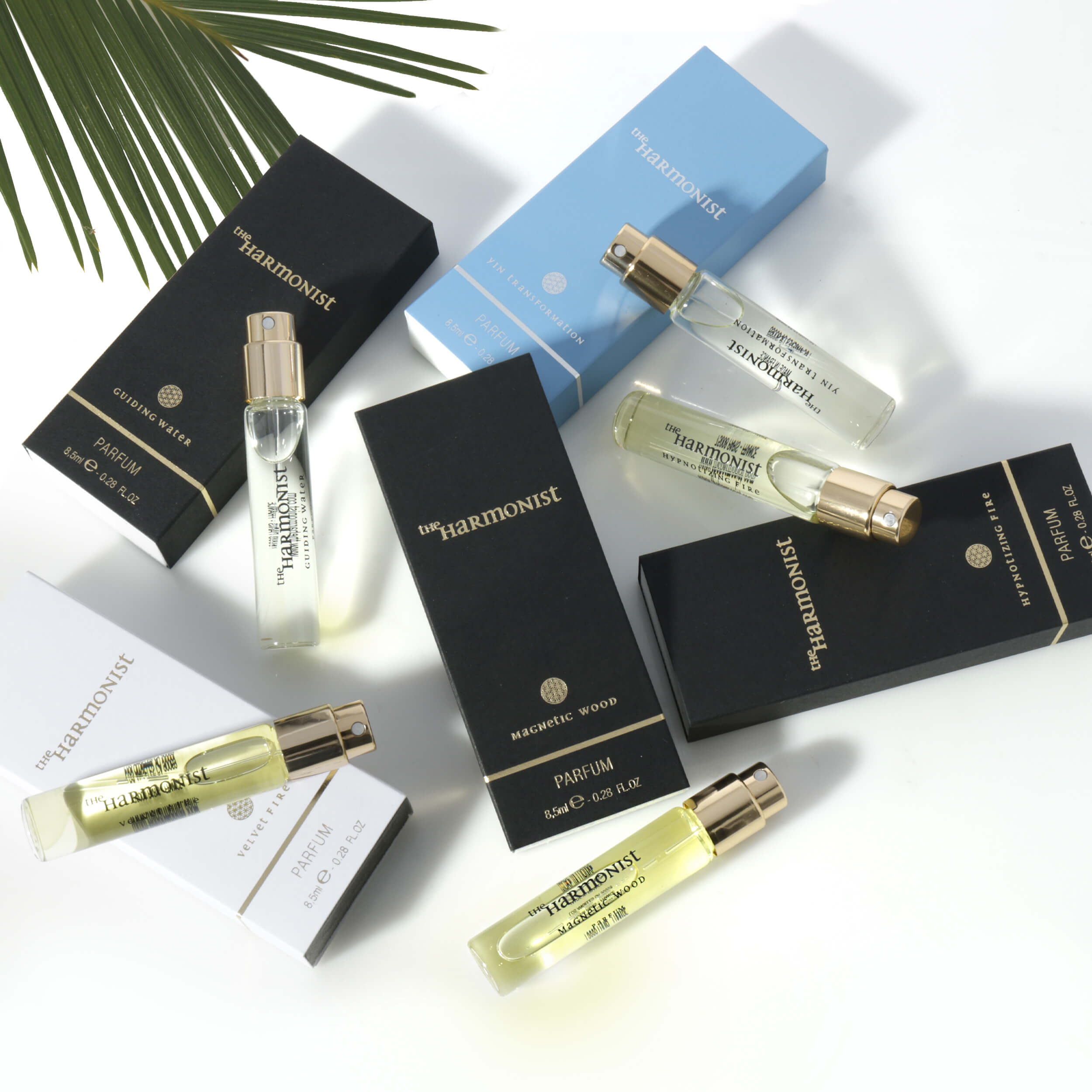
A strong image for magazine use starts with clean lighting and shape definition. Products need to feel dimensional without losing important details. Jewelry must show sparkle without blown highlights. Beauty packaging needs smooth gradients and sharp label readability. Apparel has to maintain true color and natural texture. Glass, watches, electronics, and reflective items demand even more precision because every reflection becomes part of the final design.
Then there is resolution. Magazine reproduction needs files that can handle enlargement, cropping, and layout adjustments without losing clarity. An image that looks acceptable online at a smaller size may not survive print production. This is one reason many brands run into problems when they try to repurpose casual ecommerce photography for editorial use.
Why print standards are less forgiving than ecommerce
Ecommerce images are built for speed and conversion. They often live on white backgrounds, appear in smaller dimensions, and are viewed on phones where minor imperfections are easier to miss. Magazine product photography has a different standard because the image may be enlarged, color-managed, and printed on coated stock where detail is much more visible.
That difference affects every step of production. Lighting has to be cleaner. Styling has to be tighter. Retouching has to be more refined. Color has to stay controlled from capture through final delivery. If the product includes metallic surfaces, gemstones, clear packaging, embossed labels, or fabric texture, those details need to be handled correctly before the shutter is ever pressed.
This is also where cost-saving shortcuts often become expensive. If a brand tries to shoot a print campaign quickly with lighting built for marketplace listings, the result usually needs heavy correction later. That slows the timeline and can still leave the final image looking forced. It is usually faster and more affordable to shoot for the end use from the start.
Planning a magazine shoot around the product category
Not all products need the same visual treatment, and that matters in magazine work. A skincare bottle, a gold necklace, a pair of sneakers, and a consumer electronic device each present different technical challenges. The most effective magazine product photography is category-specific because the lighting, surface styling, lens choice, and retouching approach should match the item.
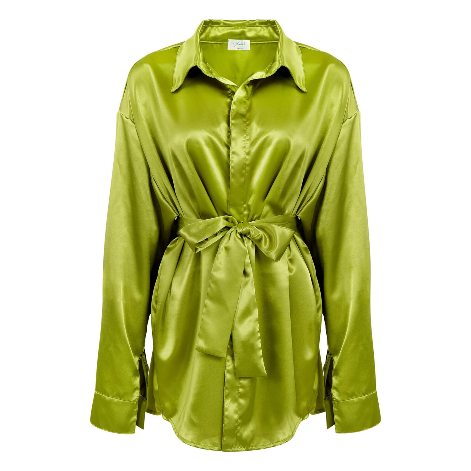
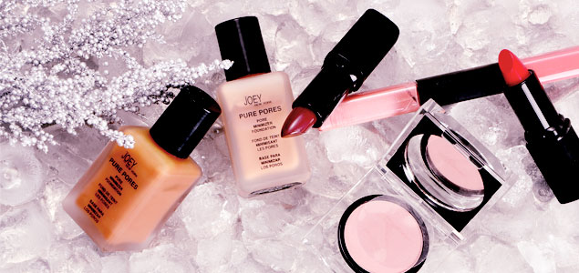
Jewelry needs crisp facet detail, controlled reflections, and clean metal separation. Apparel often needs accurate drape, color consistency, and texture that does not turn muddy in print. Beauty and beverage products benefit from shape-enhancing highlights and careful label presentation. Books, toys, household goods, and office products may seem straightforward, but they still need clean form, readable branding, and balanced shadows to avoid looking flat.
This is why experience across product categories matters. A studio that understands how different materials behave under light can move faster and produce better files with fewer revisions. That saves brands time when launch dates, ad deadlines, or publication schedules are already tight.
The role of styling in magazine product photography
Magazine imagery often carries more brand responsibility than a basic product listing. The image may appear next to editorial content, in a luxury gift guide, inside a seasonal catalog, or as part of a full-page advertisement. In each case, styling choices affect how premium, modern, or commercial the product feels.
Sometimes a clean isolated shot is the right choice. It puts full focus on the product and gives art directors flexibility in layout. Other times, a lightly styled setup or a more atmospheric composition helps the product feel aspirational. The right answer depends on the publication, the placement, and the brand.
There is always a trade-off. Minimal styling tends to be more flexible and easier to repurpose across print and digital. More elaborate creative setups can create stronger impact, but they may limit how the image can be cropped or reused later. For brands managing both advertising and ecommerce needs, it often makes sense to produce a mix of print-ready hero shots and cleaner supporting assets during the same production cycle.
Retouching matters as much as the shoot
A lot of what makes magazine product photography look expensive happens after capture. Professional retouching is not about making the product fake. It is about making the file clean, accurate, and publication-ready.
That includes dust removal, edge cleanup, color correction, label straightening, reflection control, surface refinement, and preserving realistic texture. Good retouching should never leave the product looking plastic or overprocessed. In print, over-retouched images are easy to spot, and they weaken trust.
The strongest commercial retouching supports the product’s real selling points. On jewelry, that may mean enhancing brilliance while keeping metal tones believable. On apparel, it means preserving fabric texture and true color. On cosmetics, it means making packaging look pristine without removing the dimensional cues that make it feel real.
This is one area where brands should be careful about choosing purely on price. Cheap post-production often creates haloing, inaccurate color, blurry details, and unnatural surfaces. Those problems can hurt both the brand image and the practical usability of the files.
How magazine product photography supports sales
Magazine placement is often treated as a branding play, but the sales impact is real. Strong print imagery shapes perceived value. It tells buyers, retailers, and editors that the product belongs in a premium environment. It also creates consistency across campaigns when the same high-quality visuals can be adapted for catalogs, ads, sell sheets, ecommerce banners, and social content.
That consistency matters because customers rarely interact with a brand in just one place. They may first see a product in a print ad, then search for it online, then compare images on a marketplace listing. If the visual quality changes dramatically from channel to channel, the brand feels less reliable. Strong magazine photography helps set a higher standard that can carry through the rest of the marketing system.
For growing brands, this is especially important. Professional imagery does not just make a product look good. It reduces friction. Better images improve clicks, support premium pricing, and make the brand easier to trust.
Choosing the right studio for magazine product photography
If you are hiring out this work, ask practical questions. Can the studio handle high-resolution, print-ready delivery? Do they understand product-specific lighting challenges? Can they produce consistent color and polished retouching? Can they move quickly without cutting corners?
Those questions matter more than flashy promises. A reliable commercial studio should be able to work efficiently, price competitively, and deliver files that are usable across real business channels. That includes magazines, catalogs, lookbooks, and ecommerce platforms.
For many brands, speed is part of the decision. Product launches, ad buys, and print deadlines do not leave much room for delays. A studio that combines fast turnaround with affordable pricing and professional execution gives you room to move. That is one reason businesses come to Product Photography Studio when they need polished commercial imagery without the overhead of building everything in-house.
When to invest in magazine-quality images
Not every product needs a full editorial-style production. If you are testing a low-volume SKU or refreshing a simple listing, basic ecommerce photography may be enough. But if the images are headed for print ads, catalog pages, retail presentations, media kits, investor decks, or brand-building campaigns, the quality bar rises quickly.
That is the point where magazine product photography becomes a smart business decision rather than a creative extra. You are not just paying for a nicer photo. You are paying for accurate color, better detail, stronger presentation, and files that can work across multiple sales channels.
When the product matters, the image has to carry its weight. A sharp concept helps, but execution is what gets the result. If your brand is preparing for print, think beyond getting the shot. Aim for imagery that looks credible on the page, useful in marketing, and strong enough to keep selling long after the issue is off the rack.