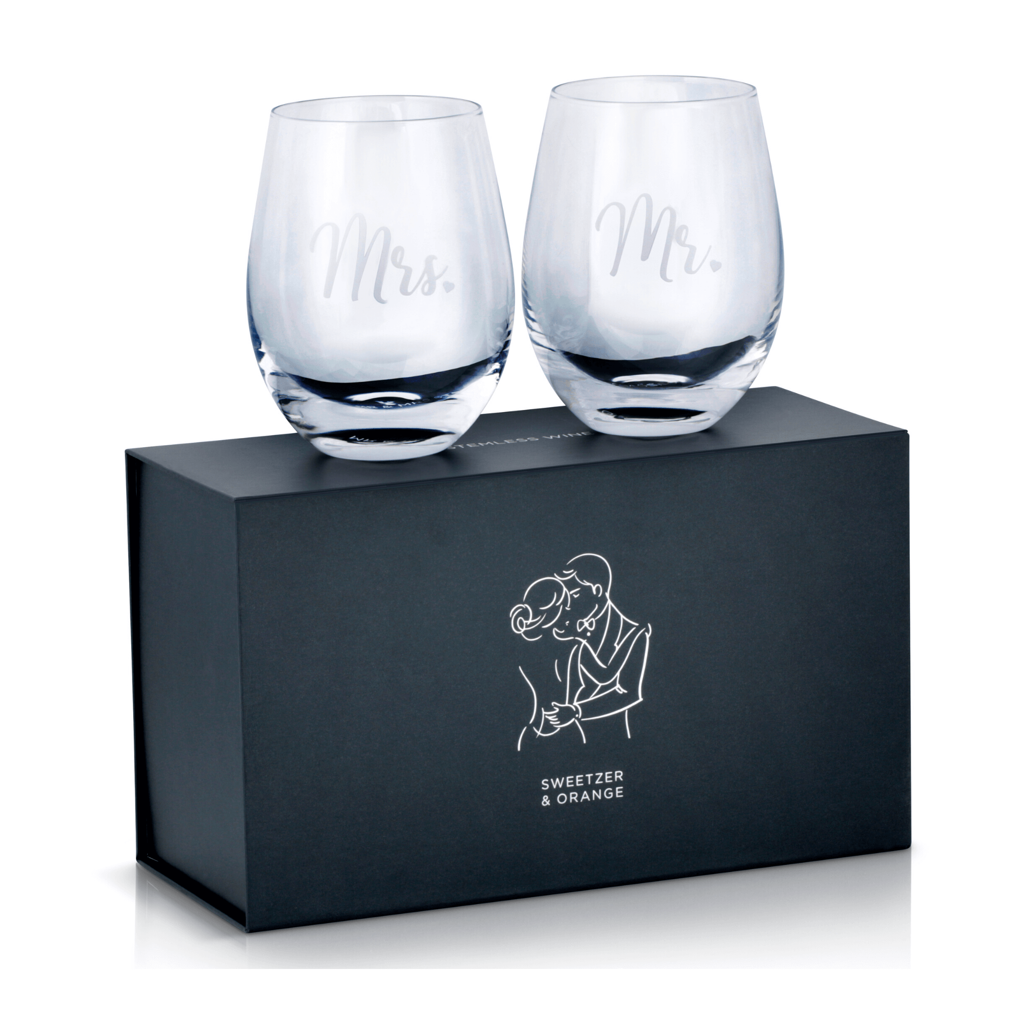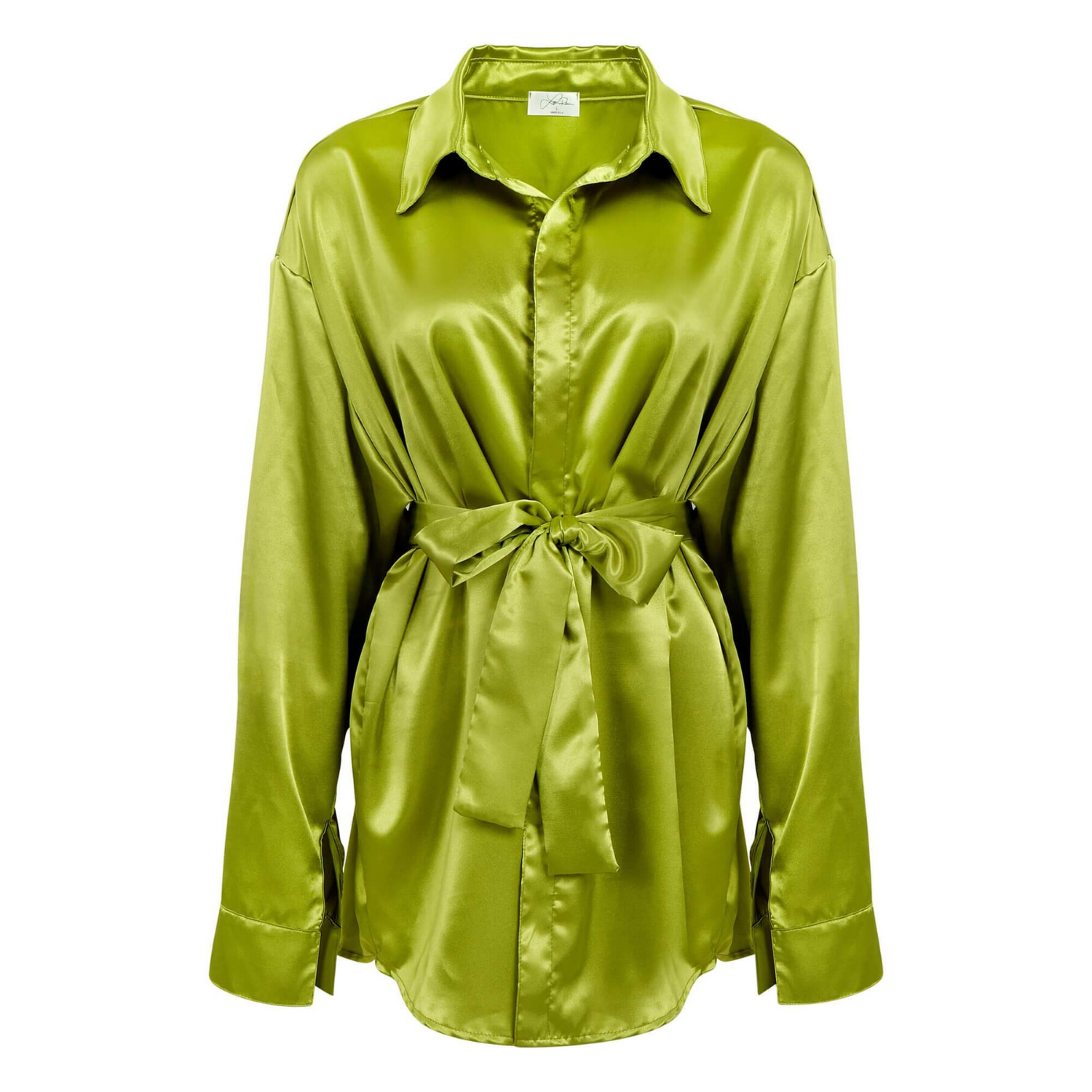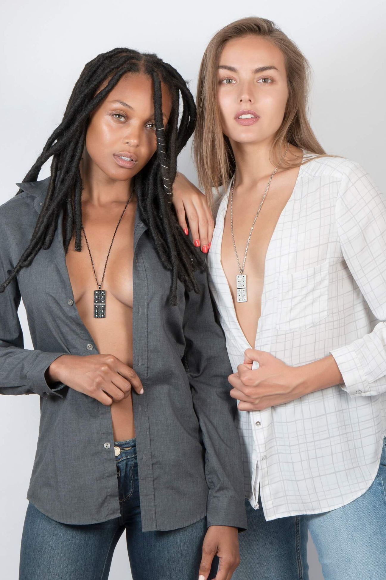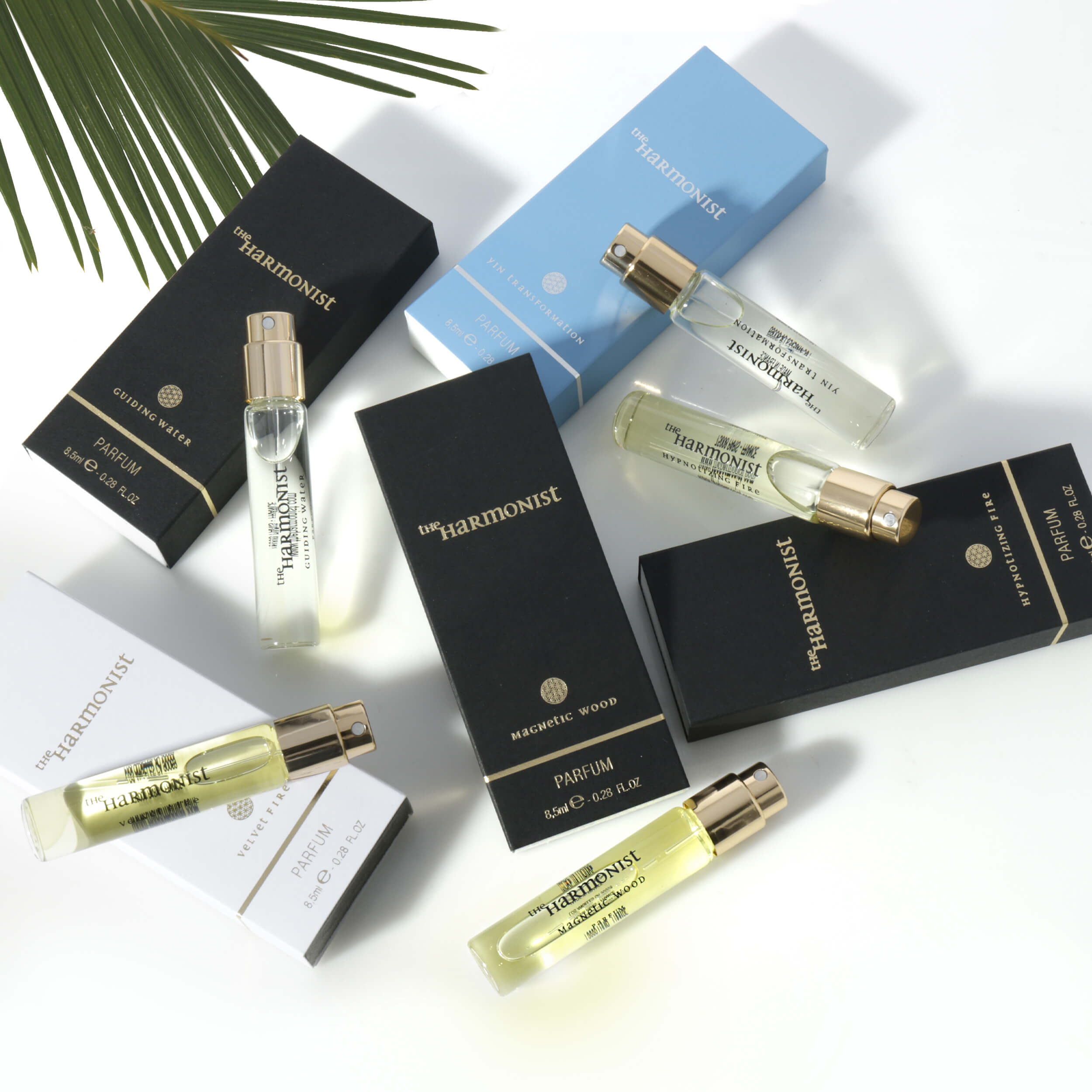
A flat white-background product shot can show what an item is. It usually cannot show why someone wants it. That is where lookbook product photography earns its place. For apparel, jewelry, accessories, beauty, and lifestyle brands, a strong lookbook turns products into styled, sellable visuals that help customers picture the item in real life and move closer to purchase.
For ecommerce brands, the value is practical. Better presentation can improve click-through rates, strengthen brand consistency, and support higher perceived value. For wholesale lines, seasonal launches, and marketing teams, it also gives you a cleaner visual system for campaigns, catalogs, and social assets. The point is not just to make products look attractive. The point is to make them easier to sell.
What lookbook product photography actually does
Lookbook photography sits between standard ecommerce imagery and full campaign advertising. It is more styled than plain product-on-white shots, but usually more product-focused than a broad lifestyle campaign. The goal is to show fit, texture, scale, styling, and brand direction without losing sight of the item being sold.
That balance matters. If images become too editorial, customers may remember the mood but miss the product details. If they are too plain, the brand loses personality. Effective lookbook product photography keeps the product as the lead while using model direction, styling, lighting, and composition to create context.
For apparel, that may mean showing drape, movement, fabric weight, and how pieces layer together. For jewelry, it may mean pairing clean close-ups with styled model shots that show scale and sparkle. For beauty, it may involve texture, application, packaging, and how the product fits into a polished brand aesthetic. Different categories need different execution, but the commercial objective stays the same: present products in a way that drives interest and reduces hesitation.
Why brands invest in lookbook product photography
The first reason is simple. Customers buy with their eyes. When shoppers cannot touch the product, photography has to do more work. A lookbook can answer the questions standard product shots leave open: How does this piece wear? Does the color feel premium? Is the style minimal, bold, classic, or trend-driven? What kind of customer is this made for?
The second reason is brand positioning. If your storefront, marketplace listings, catalog pages, and launch materials all use inconsistent imagery, the brand starts to feel less trustworthy. A cohesive lookbook gives you a repeatable visual standard. That consistency helps small brands look more established and helps growing brands stay organized across channels.
The third reason is efficiency. A properly planned shoot can generate multiple asset types from one production day. You can capture hero images for the lookbook, detail shots for marketing, cropped variations for ads, and supporting visuals for email or social. That is often more cost-effective than treating every channel as a separate project.
There is a trade-off, though. Lookbook photography usually requires more planning than basic ecommerce photography. You may need models, stylists, shot lists, props, set direction, and more retouching. The payoff can be significant, but only when the production is built around a clear sales goal.
How to plan lookbook product photography for better results
Most weak shoots fail before the camera comes out. They fail in planning. Brands know they want something elevated, but they do not define what the images need to do.
Start with usage. Are these images for a seasonal collection page, a wholesale presentation, Amazon A+ content, a direct-to-consumer launch, or a printed catalog? The answer changes framing, pacing, orientation, and retouching priorities. A fashion lookbook for line sheets is not shot the same way as a homepage hero series.
Next, clarify product hierarchy. Not every item needs equal attention. Some are hero products, some are supporting pieces, and some only need one or two frames. When that hierarchy is clear, the shoot stays efficient and the final gallery feels intentional.
Then decide how much styling is helping and how much is distracting. Strong styling supports the product. Overstyling competes with it. This is especially true for jewelry, beauty, and accessories, where heavy props can pull attention away from details that actually drive the purchase.
Casting and model direction also matter more than many brands expect. The wrong model can make the fit feel off-brand. The wrong posing can hide product features or distort proportions. Good commercial lookbook photography is not about dramatic poses for their own sake. It is about showing the product cleanly while still creating energy.
The visual details that affect sales
Lighting is one of the biggest factors in whether a lookbook feels premium or amateur. Soft light can flatter skin and fabric, but too much softness can make texture disappear. Harder light can create shape and contrast, but it has to be controlled carefully, especially on reflective surfaces like jewelry, watches, glass, and beauty packaging.
Color accuracy is equally important. If the photographed garment looks warmer, cooler, brighter, or flatter than the real item, customer expectations break down. That leads to disappointment, returns, and avoidable friction. For apparel and cosmetics, precise color handling is not just a design preference. It is part of selling responsibly.
Retouching needs the same discipline. Good retouching refines the image without making the product look unrealistic. Wrinkles can be cleaned up, skin can be polished, and distracting reflections can be corrected, but the final result still needs to feel believable. Over-retouching may look glossy at first glance, yet it often weakens trust.
Composition also carries weight. Crops should feel deliberate, not random. Product details should be visible where they matter most. If every frame looks different in angle, scale, and lighting style, the lookbook starts to feel pieced together instead of professionally produced.
Lookbook product photography vs standard ecommerce images
This is not an either-or decision for most brands. You usually need both.
Standard ecommerce images are built for clarity. They show the item plainly, often on white, and help shoppers review details fast. They are essential for product pages, marketplaces, and comparison-based browsing. Lookbook product photography serves a different job. It creates desire, reinforces branding, and gives context that basic listing images cannot provide on their own.
If you only use standard packshots, the brand can feel flat. If you only use styled lookbook images, customers may miss technical details that affect purchase decisions. The strongest product presentation combines clean product imagery with styled visuals that show how the item fits into a real wardrobe, routine, or setting.
That combination is especially useful for brands selling across multiple channels. A marketplace listing may need strict image standards, while your website and launch materials need stronger brand storytelling. One does not replace the other. They work better together.
What a commercial studio should understand before the shoot
A good photography team should understand your product category, not just cameras and lighting. Apparel needs fit awareness and color consistency. Jewelry needs control over reflections, metal tone, and gemstone detail. Beauty products need clean packaging, texture realism, and polished surfaces. If the team does not know the category, production slows down and image quality becomes less predictable.
They should also understand output requirements. A lookbook is not only about beautiful originals. It is about delivering usable files for ecommerce, print, marketing, and sales teams without creating extra work on your side. Fast turnaround, clean retouching, and high-resolution delivery matter because speed and reliability matter in commerce.
This is where an experienced service studio can save brands time. Product Photography Studio, for example, works across apparel, jewelry, beauty, accessories, and many other product categories with a commercial focus on quality, speed, and conversion-friendly results. That kind of category range is useful when brands need consistency across different product lines.
Getting more value from one lookbook shoot
The smartest shoots are built for reuse. Instead of treating a lookbook as a single-purpose asset, plan it as a content engine. The same setup can produce collection images, cropped web banners, social-ready verticals, print-ready files, and detail-driven marketing shots if the production plan accounts for those needs upfront.
That does not mean trying to do everything at once. It means being selective. A clear shot list, efficient set styling, and realistic timeline will usually produce stronger assets than an overloaded creative brief. More images are not always better. Better-targeted images usually outperform a bloated gallery.
If budget is tight, prioritize the products with the highest margin, strongest demand, or most visual impact. A smaller, well-executed lookbook often performs better than a large but inconsistent one. The same logic applies to retouching and styling. Spend where customers will notice the difference.
Lookbook photography works best when it respects both aesthetics and sales reality. It should make the brand look sharper, the product look clearer, and the buying decision feel easier. If your current imagery is only documenting the item instead of selling it, that is usually the point where a lookbook becomes a smart next move.