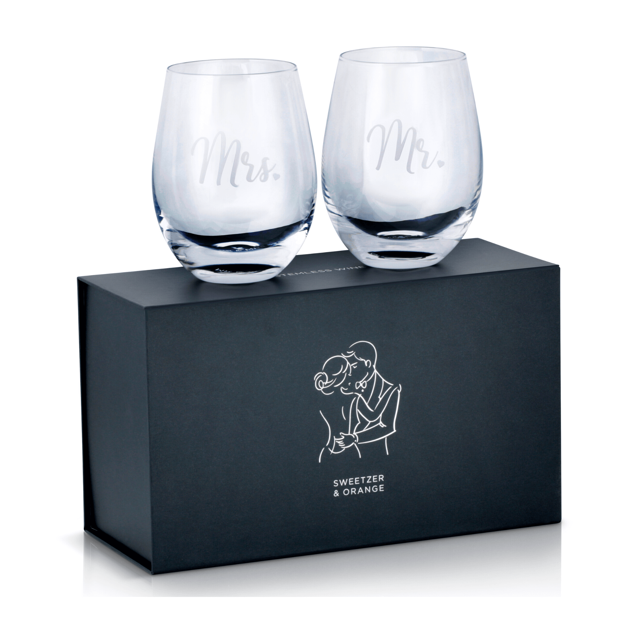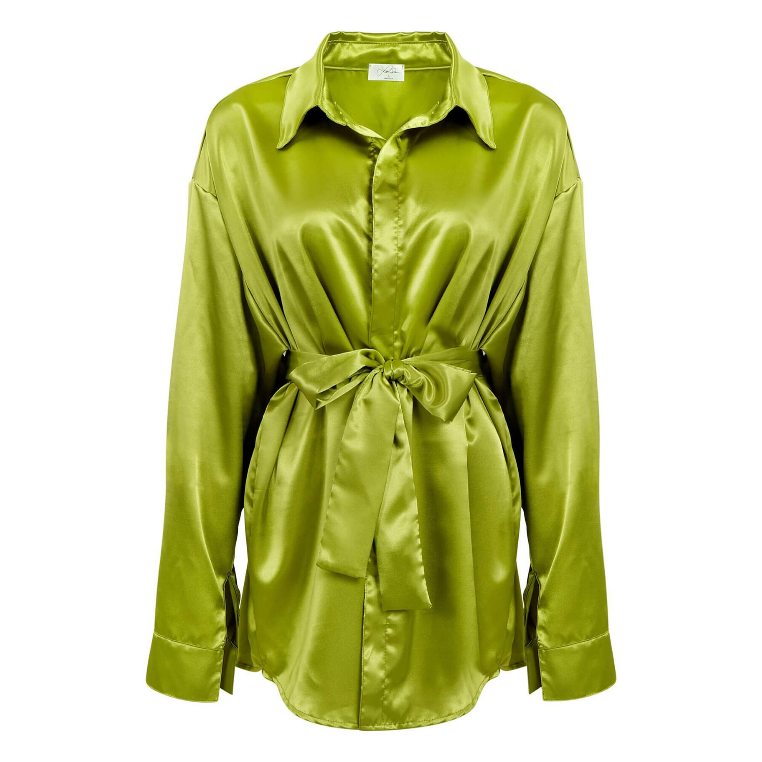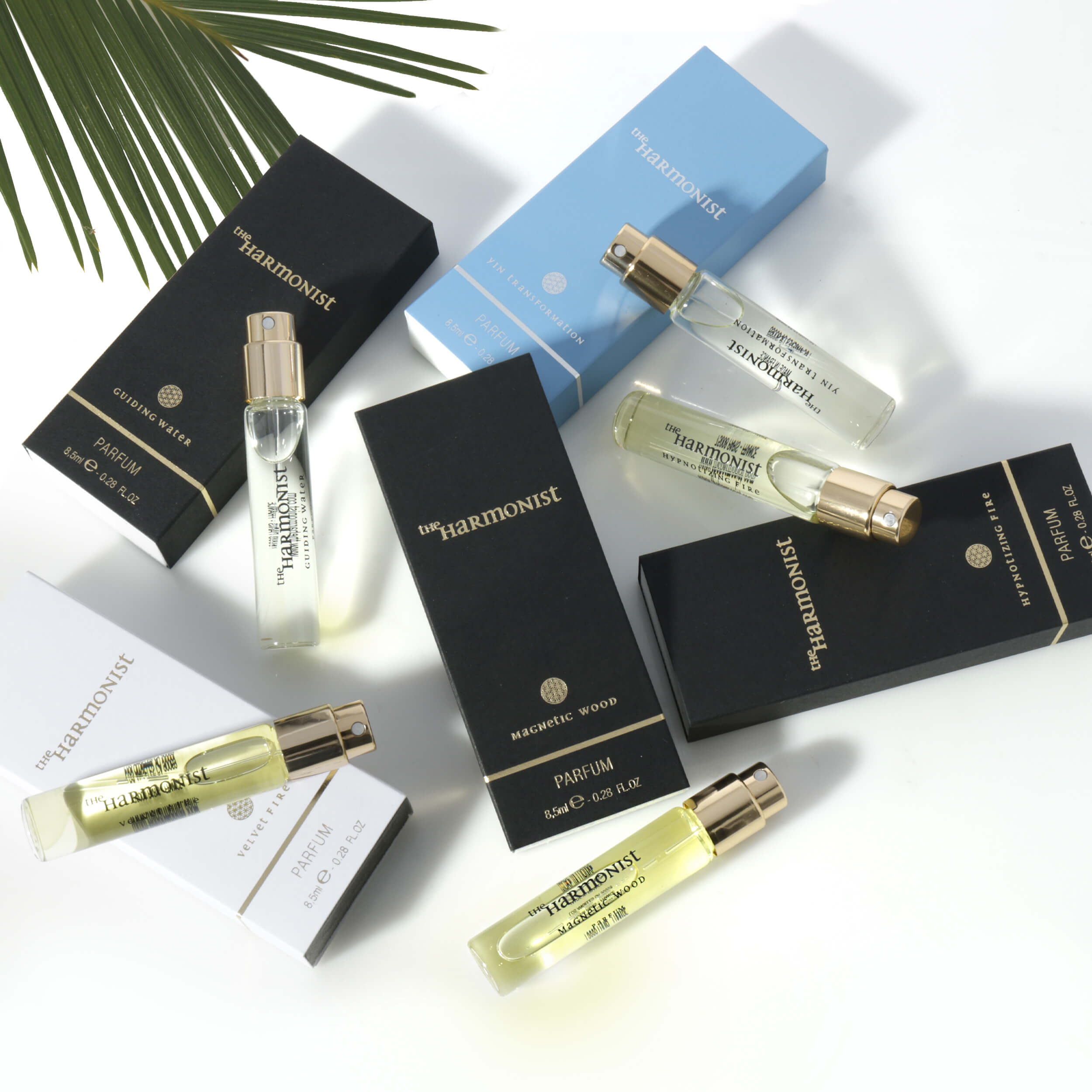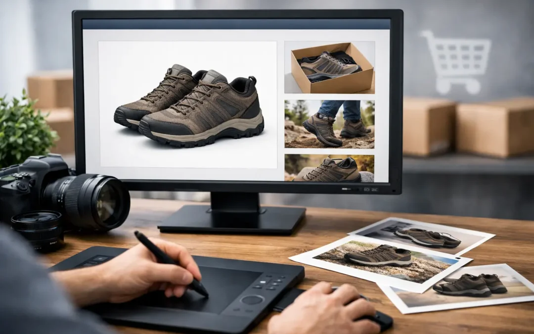
A shopper can compare your product with five competing listings in less time than it takes to read a title. That is why learning how to improve Amazon listing images is not simply a design exercise. It is a direct way to earn more clicks, answer objections faster, and give customers enough confidence to buy.
A strong Amazon image set does two jobs at once. It meets marketplace requirements so your listing stays eligible, and it presents the product as clearly as it would appear on a retail shelf. The best results come from planning every image around a real sales question: What is it? What makes it better? How large is it? How does it work? Why should a customer trust this brand?
How to Improve Amazon Listing Images Before the Shoot
Most weak image sets are not caused by a lack of camera equipment. They are caused by a lack of direction. Before photography begins, review your product detail page, customer reviews, competitor listings, and return reasons. This gives you a practical shot list based on the information customers actually need.
Start with the product’s strongest buying points. A skincare brand may need to show texture, ingredients, applicator details, and bottle size. An apparel seller needs accurate color, fit, fabric texture, and construction. A jewelry listing may depend on close-up work that shows stone clarity, metal finish, clasp design, and scale.
Then identify likely hesitation points. If buyers regularly ask whether an item fits in a standard cup holder, show it in one. If they are unsure whether a cable works with a particular device, show the connector clearly. If a product is small, include a clean scale image with dimensions. Good listing images prevent questions that might otherwise stop a purchase.
Build a purposeful image sequence
Amazon allows multiple images, but more images do not automatically create more sales. Each frame should introduce useful information rather than repeat the same angle with a different crop. A well-planned sequence usually includes a compliant main image, alternate product views, close-up detail images, scale or dimension visuals, lifestyle images, and feature-focused graphics where permitted.
The exact mix depends on the category and price point. A simple household item may need six concise images. A premium electronic product with multiple functions may benefit from a fuller set. The standard is simple: every image should make the product easier to understand and easier to choose.
Make the Main Image Win the Click
The main image is often the first visual a shopper sees in search results. It has one job: make the product immediately recognizable, professional, and appealing at a small size.
For many Amazon categories, the primary image should show the product on a pure white background, filling most of the frame. It should be sharp, properly exposed, and free of distractions. Amazon’s requirements can vary by category, so always verify the current image rules for your specific product type before finalizing the asset.
Avoid adding text, badges, promotional claims, borders, props, or extra items that are not included with the purchase. These additions may look useful in an ad, but they can make a main image noncompliant or visually cluttered. Save comparison points, callouts, and lifestyle context for secondary images.
Professional retouching matters here. Dust, fingerprints, rough edges, inconsistent shadows, and inaccurate color can make a legitimate product look cheap. Retouching should clean up the presentation without changing the product itself. Customers should receive what the image promises.
Show the Details That Drive Decisions
Once shoppers click into the listing, they want proof. Secondary images should answer the questions the main image cannot.
A close-up of a watch clasp, the weave of an apparel fabric, the finish of a cosmetic cap, or the ports on an electronic device can communicate quality quickly. These details are especially valuable when they support a higher price point. If the craftsmanship is a reason to buy, it needs to be visible.
Color accuracy is equally important. This is critical for apparel, beauty, jewelry, home goods, and any product sold in multiple variations. Over-saturated editing may earn attention, but it can also increase returns when the delivered item does not match expectations. Use controlled lighting, calibrated editing, and consistent product photography across every variation.
Use infographics carefully and clearly
Feature graphics can help shoppers understand benefits at a glance. They work best when the message is short, readable on mobile, and supported by the visual. For example, a graphic can identify the capacity of a beverage container, show a product’s dimensions, or call out compatible devices.
Do not turn an image into a crowded brochure. Tiny copy, excessive icons, and multiple competing claims create friction. One image should generally communicate one major advantage. Keep the hierarchy clear: product first, benefit second, supporting text last.
Be precise with claims. Statements about medical, cosmetic, safety, environmental, or performance benefits can require substantiation and may face category-specific restrictions. If a claim is not clearly supported, do not place it in the image set just because competitors do.
Add Lifestyle Images That Make Ownership Feel Real
White-background photography earns the click. Lifestyle photography often earns the emotional commitment.
The right lifestyle image shows the product in a believable setting with appropriate scale and context. A kitchen tool should look useful in a real kitchen. A handbag should show how it carries and fits into a customer’s day. A beauty product can show its application environment, provided the result remains honest and aligned with marketplace policies.
Lifestyle photography should never bury the product in scenery. The customer still needs to see exactly what is being sold. Choose props, surfaces, models, and environments that reinforce your brand without competing for attention.
For products with a specific audience, casting and styling matter. A luxury accessory, a children’s toy, and a medical support item require different visual cues. The goal is not to create a generic stock-photo moment. It is to help the intended customer picture the product in use.
Design for Mobile First
Many Amazon customers shop on a phone, where small details disappear quickly. Review every image at mobile size before uploading. If a label cannot be read, a callout cannot be understood, or the product blends into the background, the image needs revision.
Use large, high-contrast type in secondary graphics. Keep dimension diagrams simple. Crop tightly enough for the product to remain prominent, but leave enough space to show its shape and function accurately. High-resolution files are essential, yet resolution alone will not fix an image that has poor composition.
Consistency also matters across the full listing. Similar lighting, background treatment, retouching quality, and color balance create a polished visual experience. When the image set feels inconsistent, shoppers may assume the product quality is inconsistent too.
Test Images Against Conversion, Not Personal Taste
A founder may prefer a dramatic angle, while a customer may respond better to a straightforward view that clearly shows the product size. When possible, let performance guide the decision.
Track click-through rate, conversion rate, return reasons, customer questions, and review feedback after updating your image set. A higher click-through rate may indicate that the main image is working. Better conversion can suggest that your detail, lifestyle, and infographic images are reducing uncertainty. If conversion improves but returns rise, check for inaccurate color, misleading scale, or claims that create the wrong expectation.
Do not change every image at once if you want to understand what worked. Prioritize the main image and the first few secondary images, then measure results over a meaningful period. Seasonality, advertising changes, price adjustments, and inventory levels can affect performance, so use context when evaluating the data.
When Professional Product Photography Pays Off
DIY photography can be practical for early-stage testing or simple products with limited budgets. But it becomes expensive when inconsistent lighting, inaccurate color, and time-consuming edits weaken a listing that is already receiving traffic. If shoppers are arriving but not buying, image quality is often worth examining before increasing ad spend.
A commercial product photography team can provide controlled lighting, high-resolution capture, precise retouching, and category-specific styling without the cost of building an in-house studio. For brands selling across Amazon, retail, catalogs, and their own ecommerce site, that consistency also makes every marketing channel easier to manage.
Product Photography Studio creates polished, conversion-focused product images with fast turnaround and pricing that can start as low as $12 per image. The goal is straightforward: give your products the clear, professional presentation they need to compete.
Your next image update does not need to be a complete creative overhaul. Start with the shopper’s biggest unanswered question, then create one image that answers it better than every competing listing on the page.